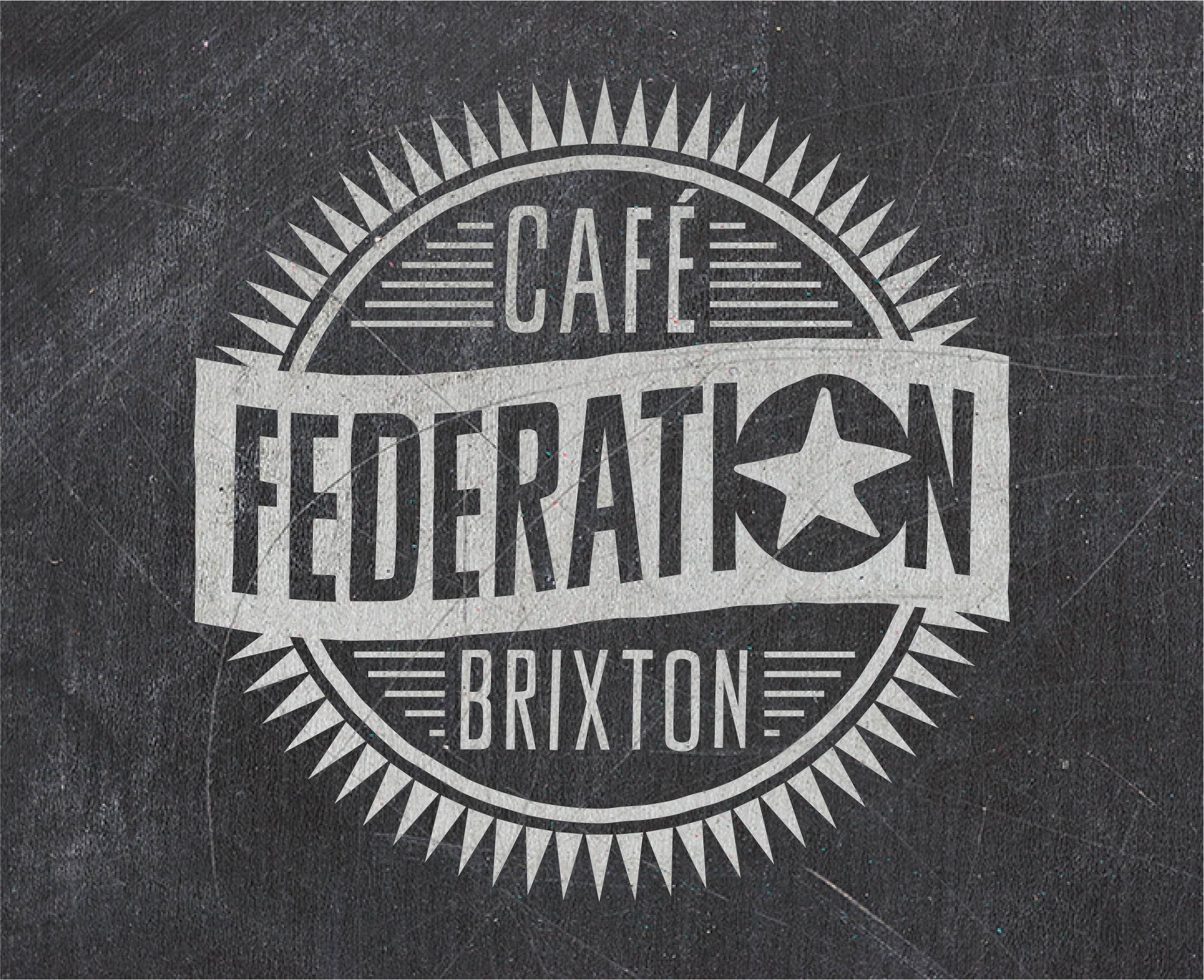
Federation Coffee — Brand Identity and Visual Language
Scope: Brand strategy, visual identity, copywriting, and marketing collateral for an independent coffee brand.In a retail coffee market dominated by high street chains and niche micro-roasters, Federation Coffee aimed to create a distinctive and engaging experience: less formal than micro-roasters, more personable than faceless chains, while maintaining quality, great taste, and a friendly atmosphere.
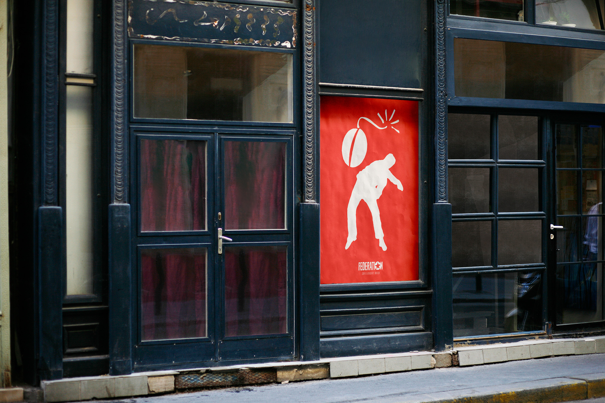
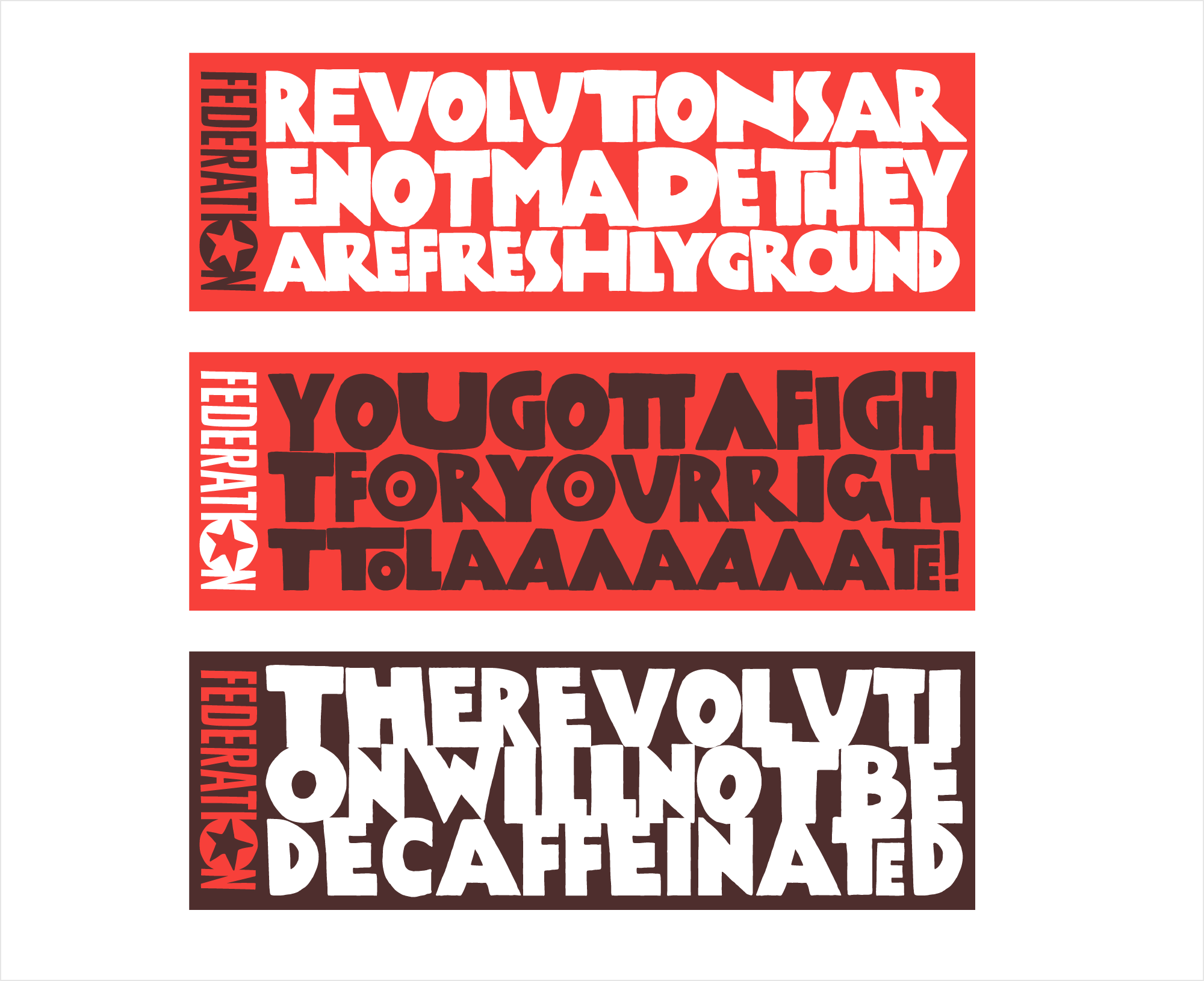
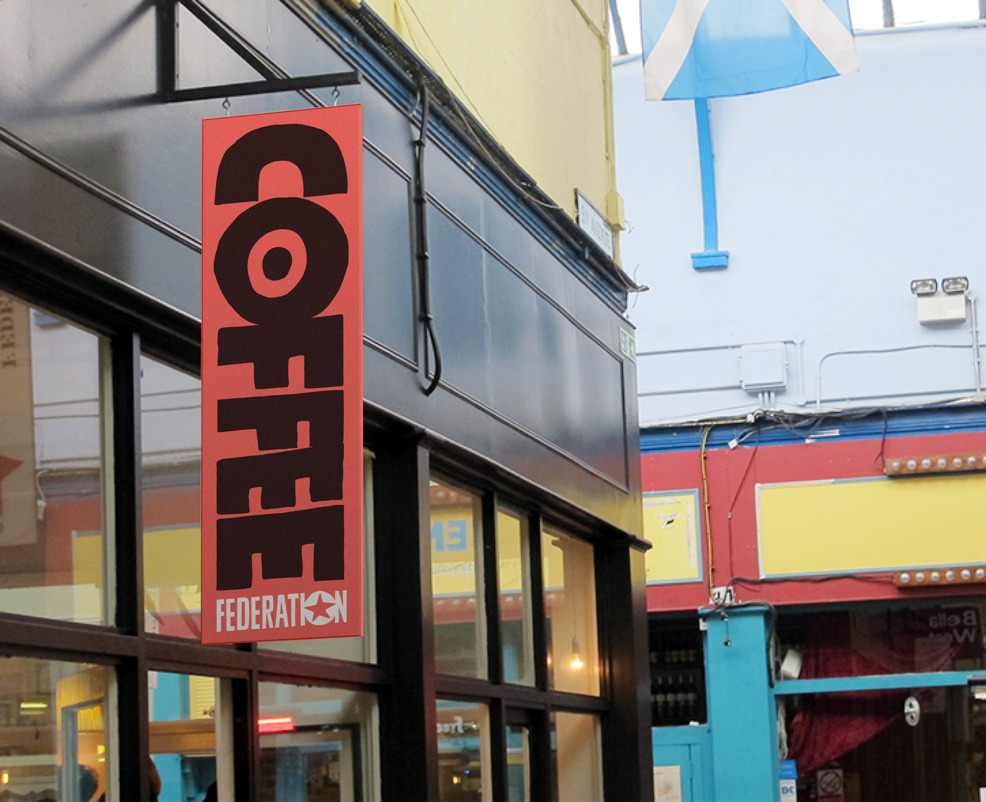
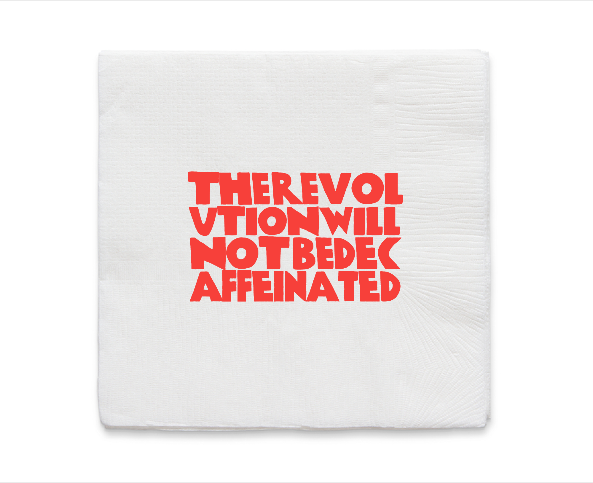
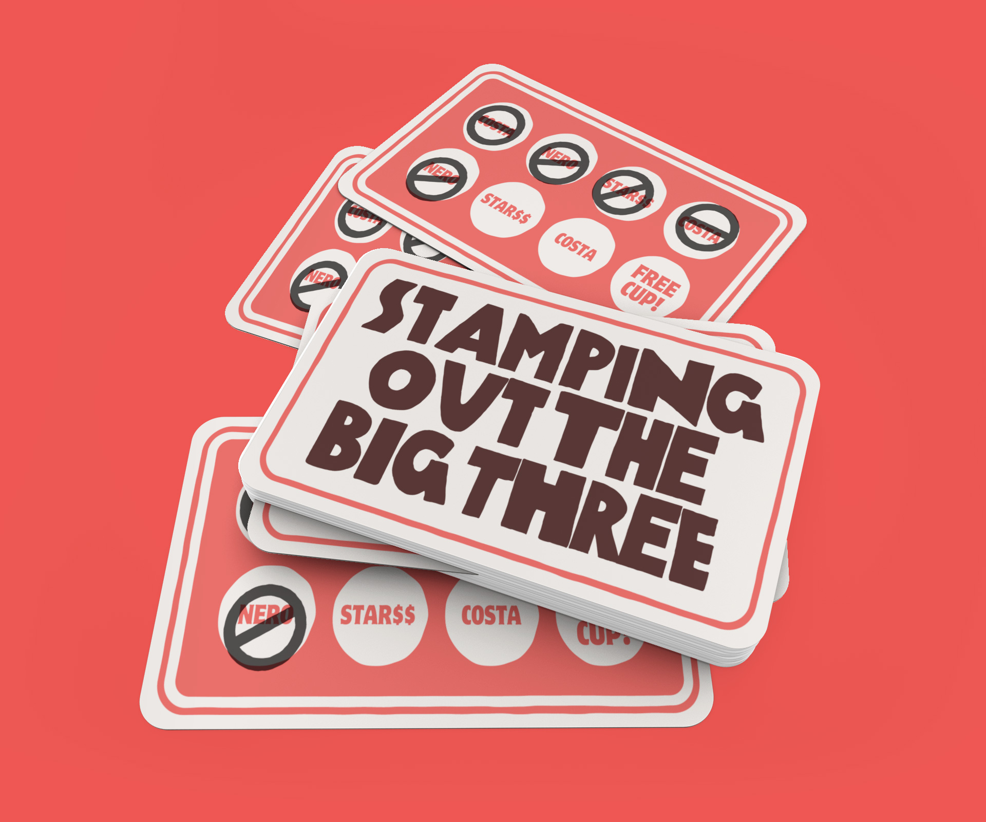
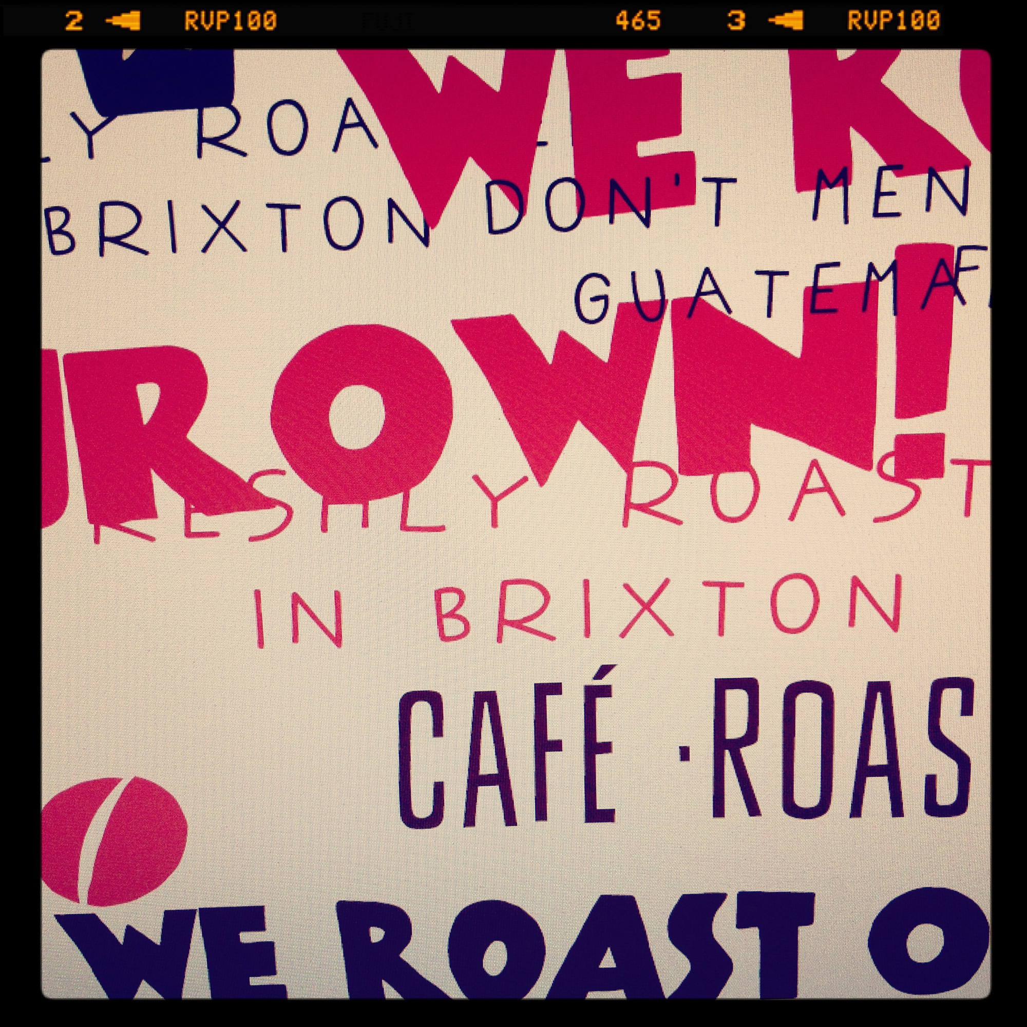
Guided by a brand strategy focused on disruption, I developed a visual and written language around the idea of “revolution”. The identity combined bold, irreverent slogans, confident graphics, and playful jabs at larger competitors, reflecting the brand’s independent spirit and aligning with the vibrant Brixton Market location of its flagship shop.
The visual inspiration drew from 20th-century revolutionary movements across Europe, Russia, and Latin America, influencing the selection of fonts, colours, and graphic elements to communicate a tongue-in-cheek revolutionary feel.
Deliverables included:
-
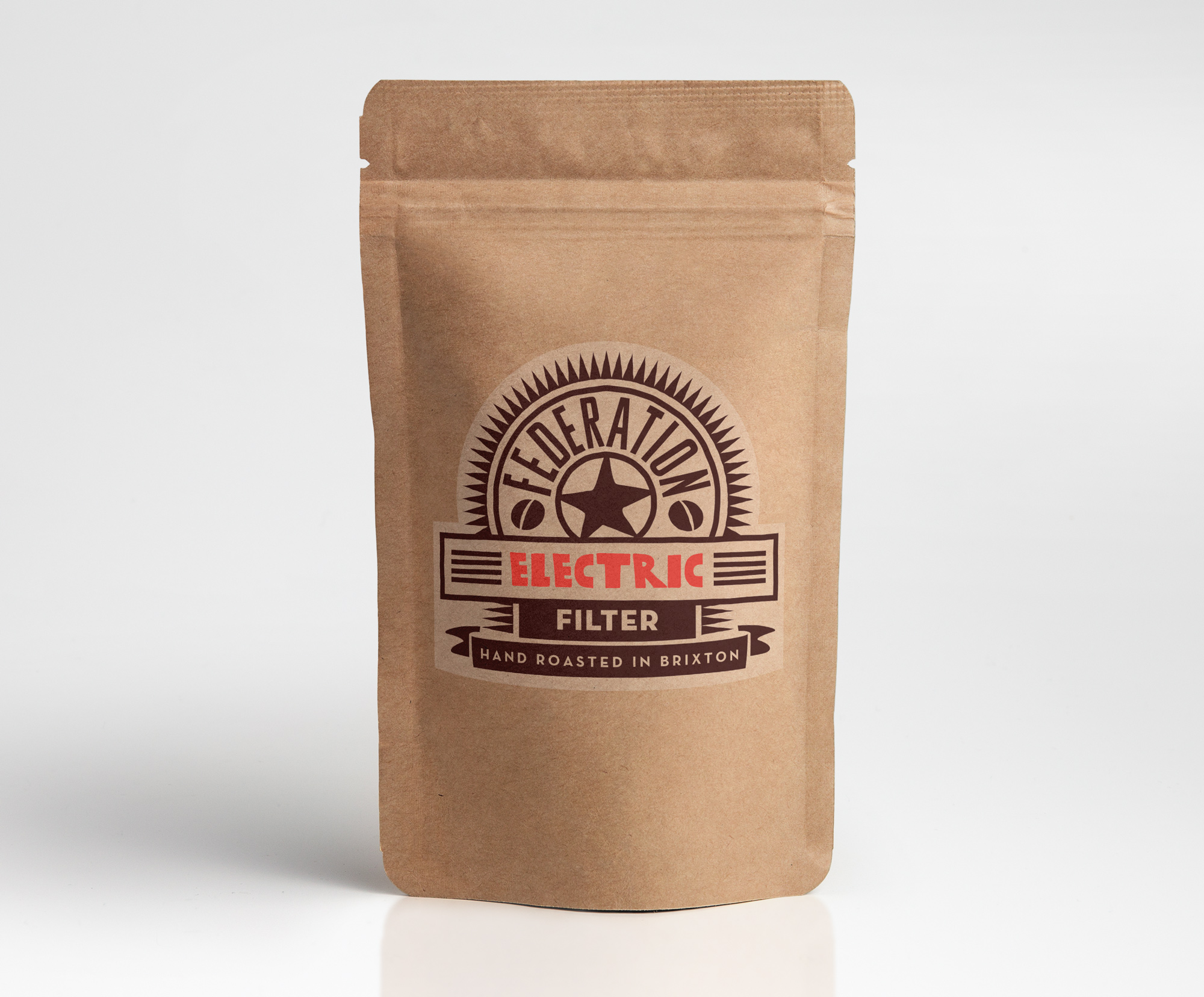
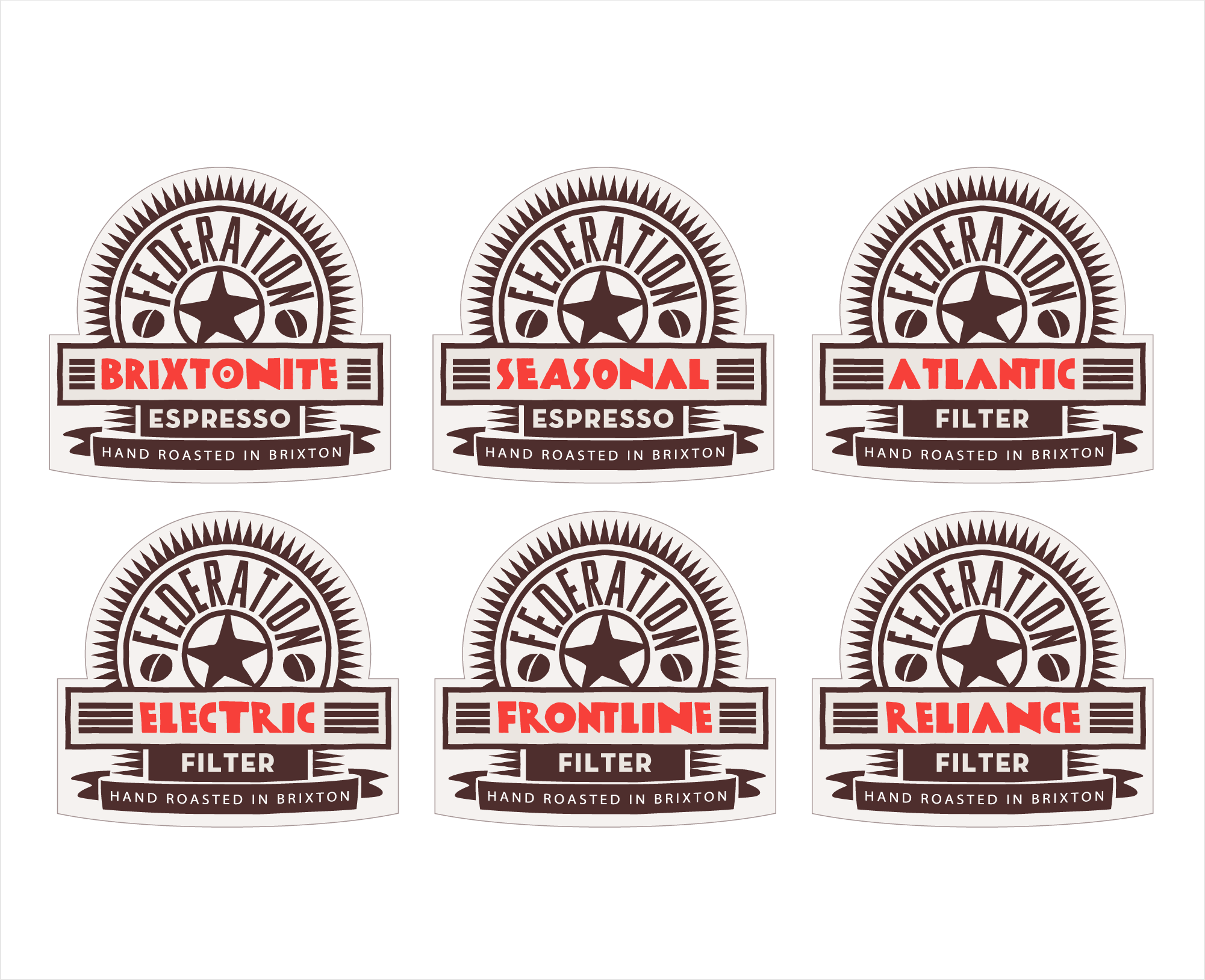
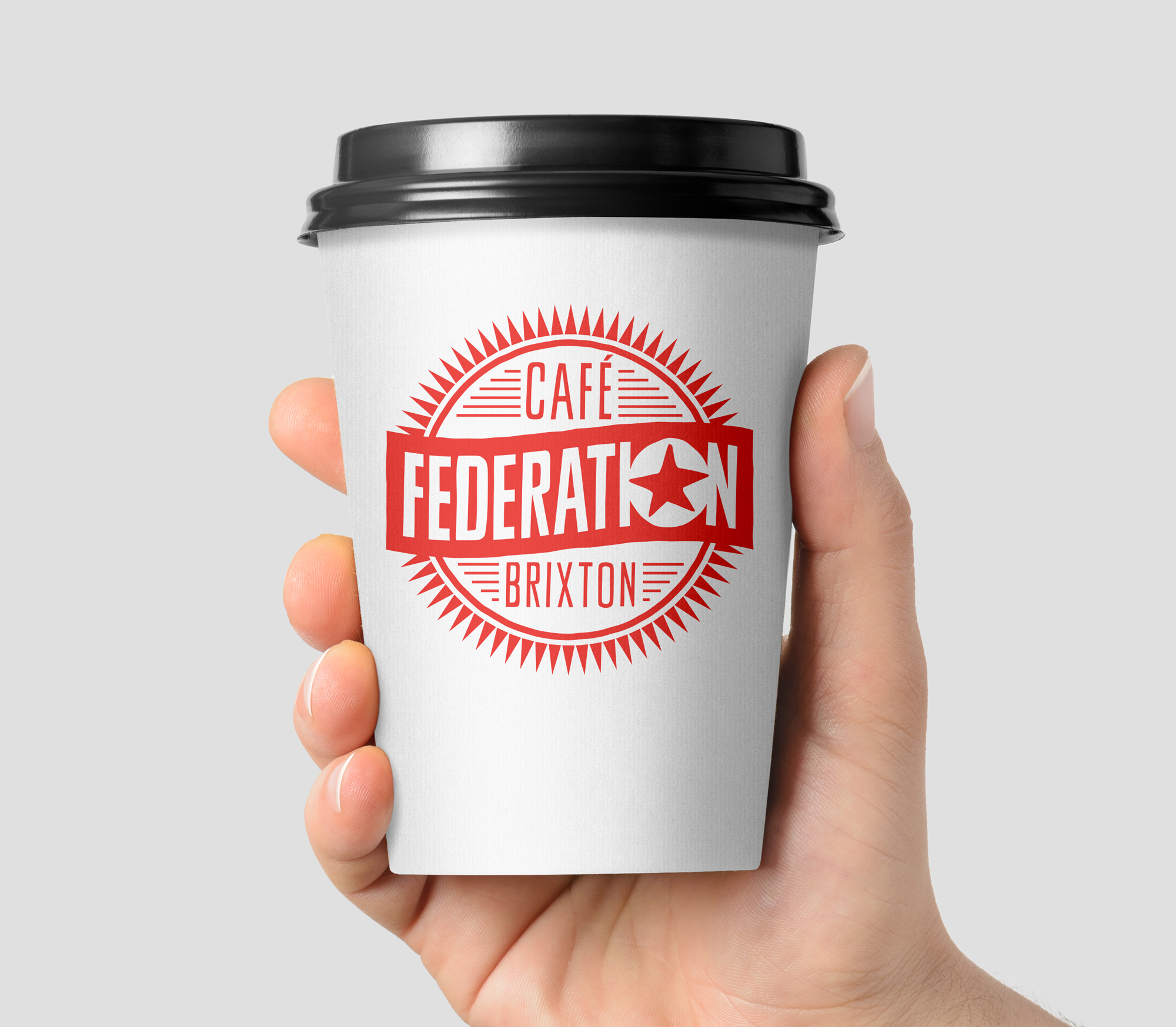
Custom word mark and brand copy
-
Posters, pack labels, and signage
-
A range of marketing collateral designed to express the brand’s attitude and presence
The resulting identity positioned Federation Coffee as a bold, independent, and engaging brand, standing out in a competitive coffee market while remaining approachable and fun.
Project in collaboration with Design Strategist, Ben Maxwell.