Scope: Brand identity, visual language, marketing materials, and UI design for an international water technology company.
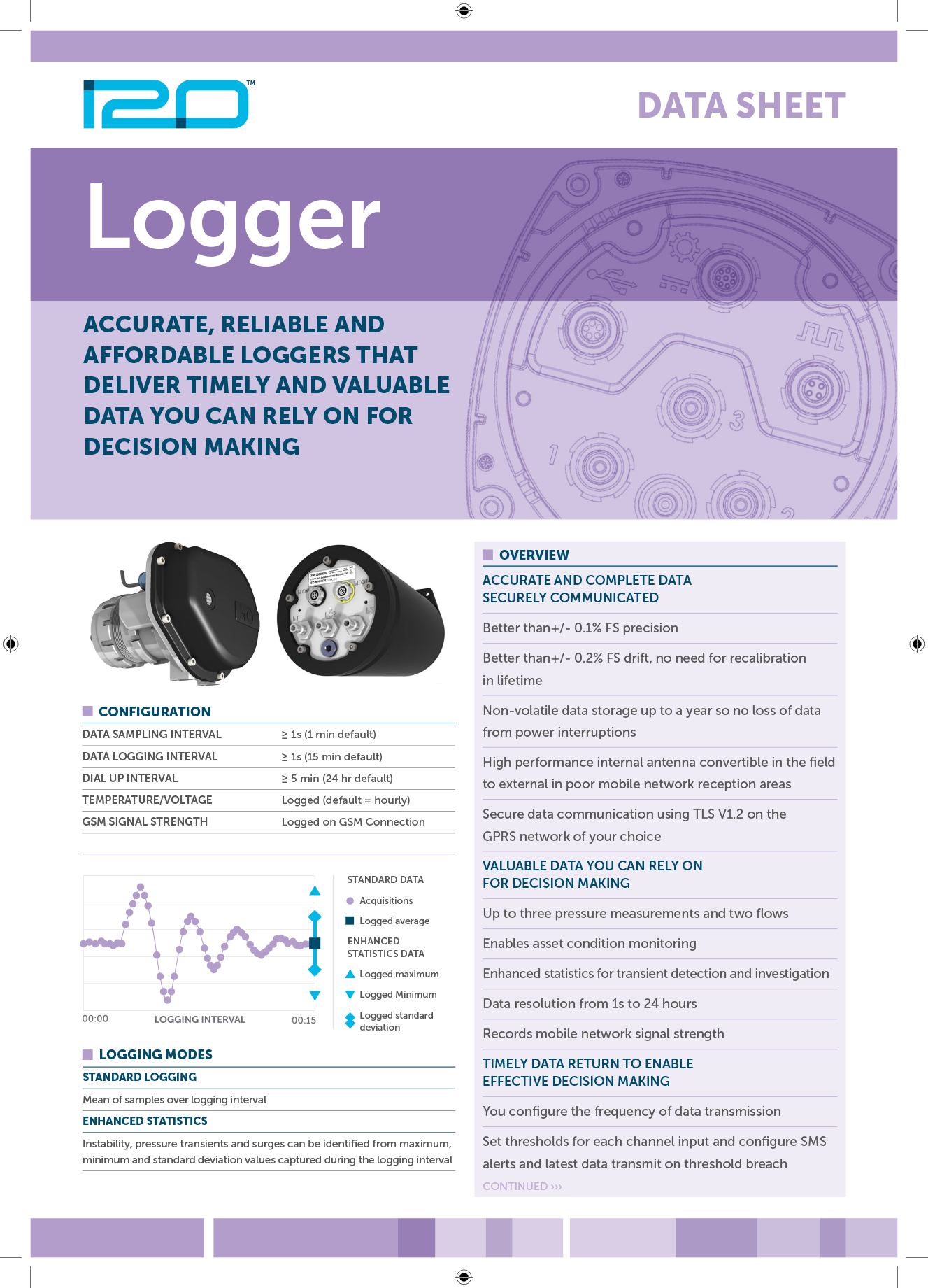
i20 work with water utilities around the world to improve system efficiency and reduce leakage through smart logging hardware, remote controllers and customer service software. Their existing brand identity no longer reflected their position as a dynamic, forward-thinking leader in water innovation — it felt outdated, constrained, and lacked the confidence of a modern technology company.
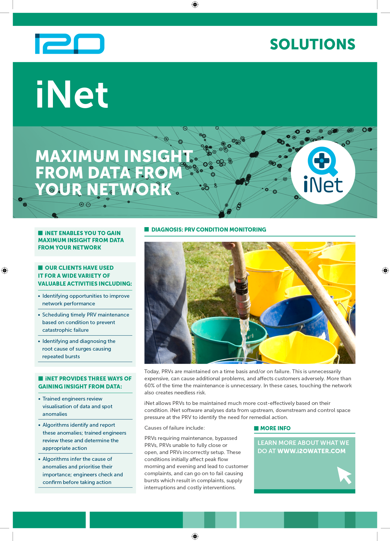
I developed a bold, contemporary visual identity centred around a new logo that subtly references pipes, networks and nodes, tying directly to i20’s engineering and data-driven foundations. A refreshed colour palette took inspiration from the fluidity and clarity of water, reinforcing the company’s connection to sustainability and utility performance.
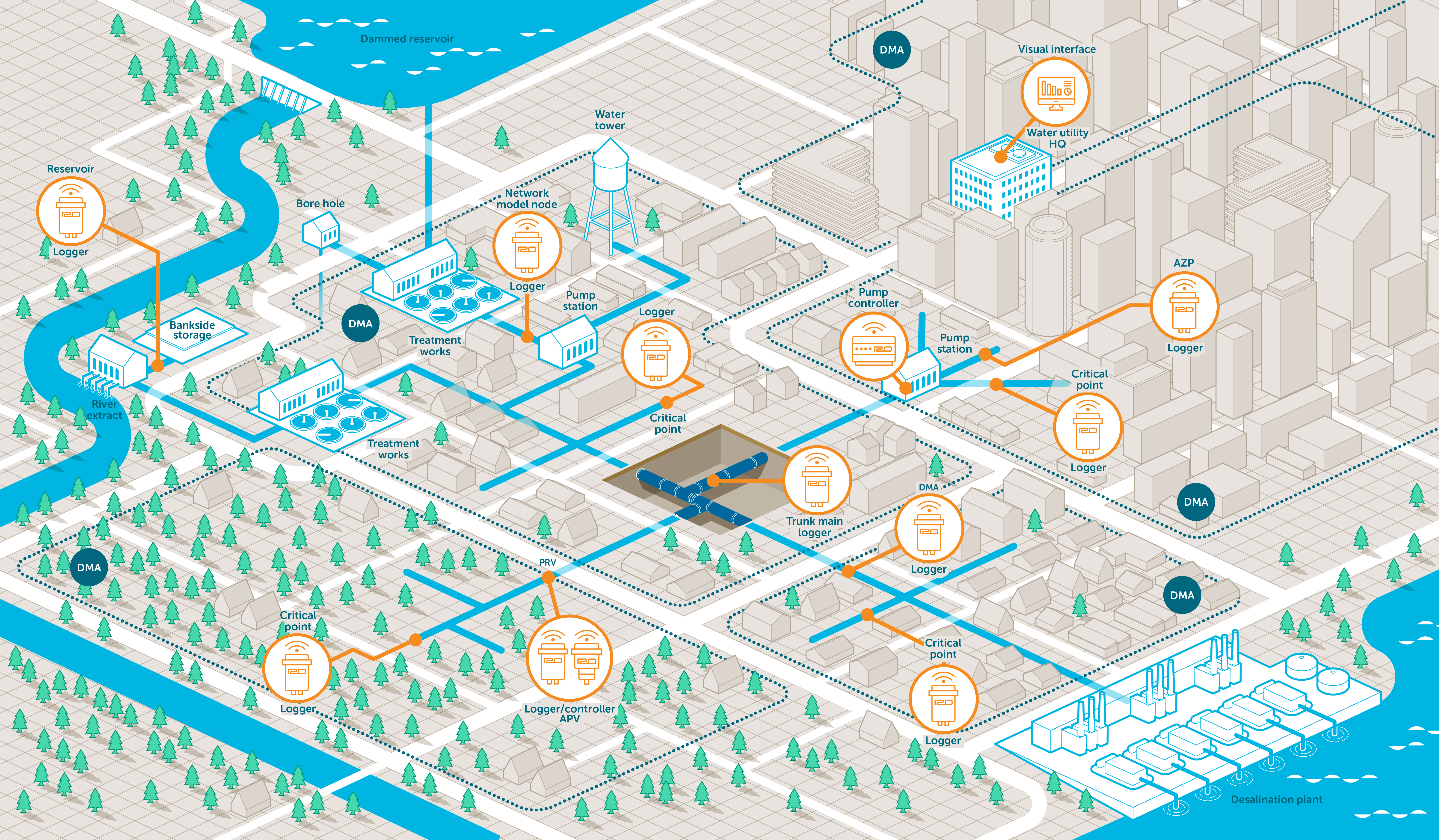
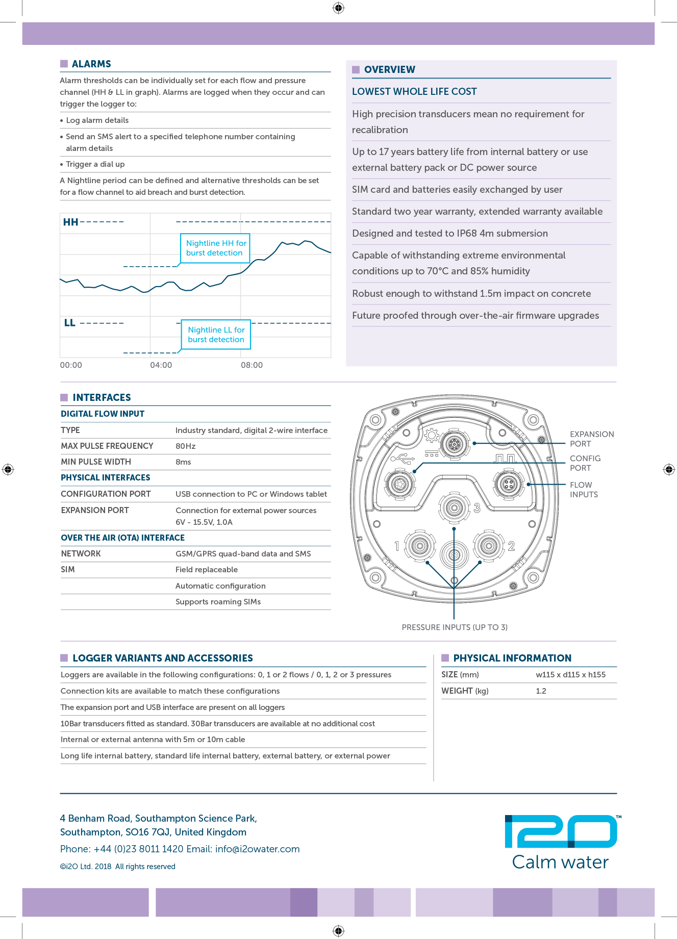
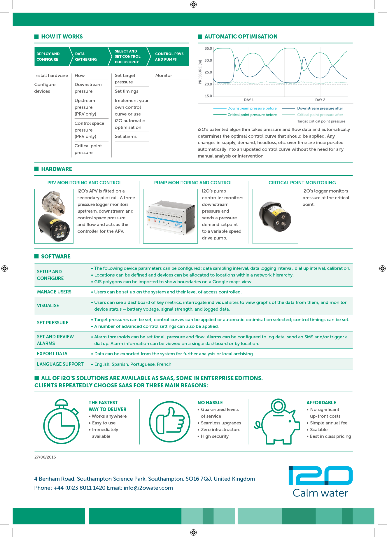
The wider visual language was built around layering, depth and data, allowing flexibility across a spectrum of communications — from bold marketing campaigns to analytical information design. To support i20’s global operations, the chosen type system offered full multilingual capability.
Deliverables included:
• Comprehensive identity guidelines for implementation across all media
• Information design and UI elements for digital interfaces
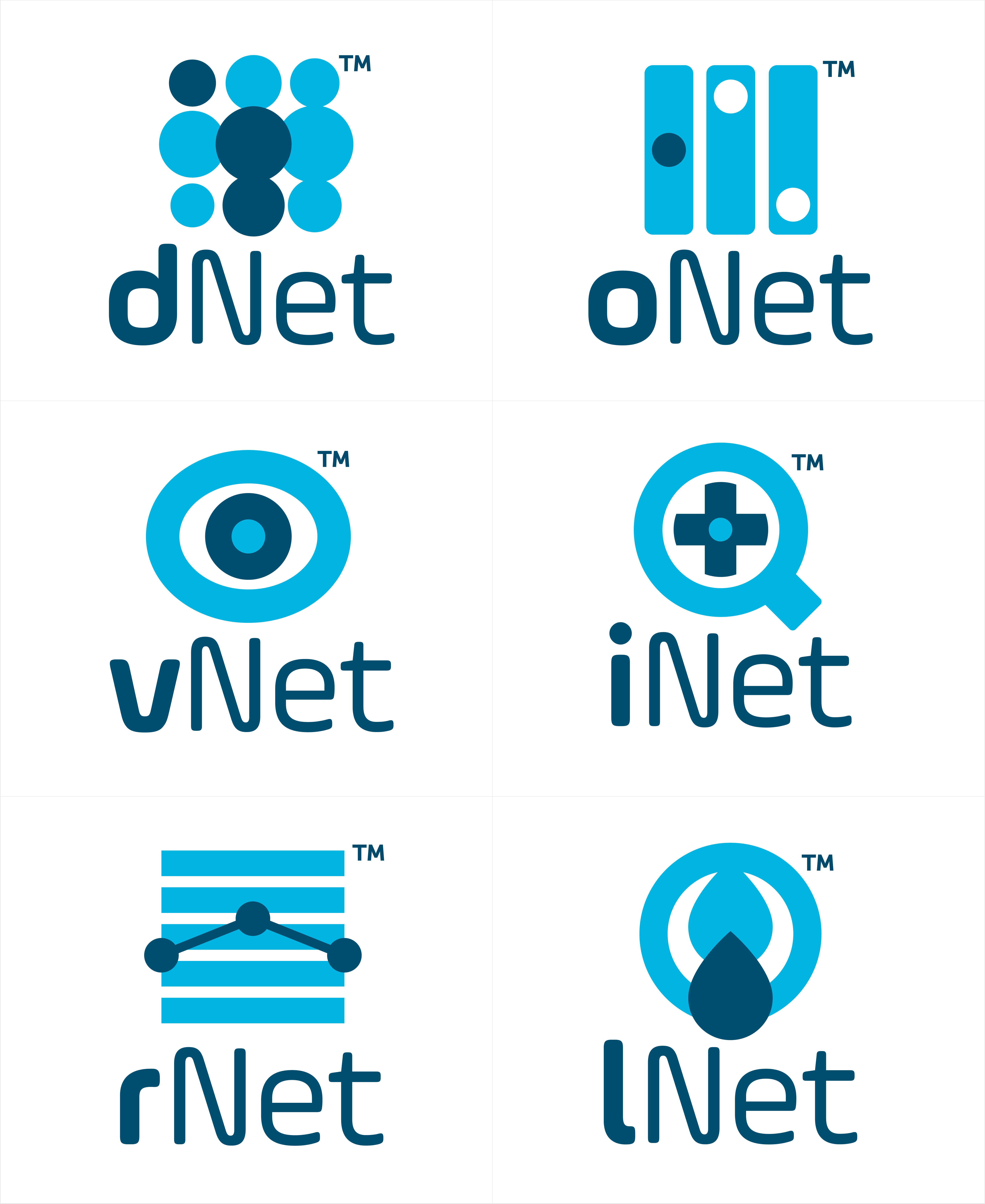
• A unified icon family
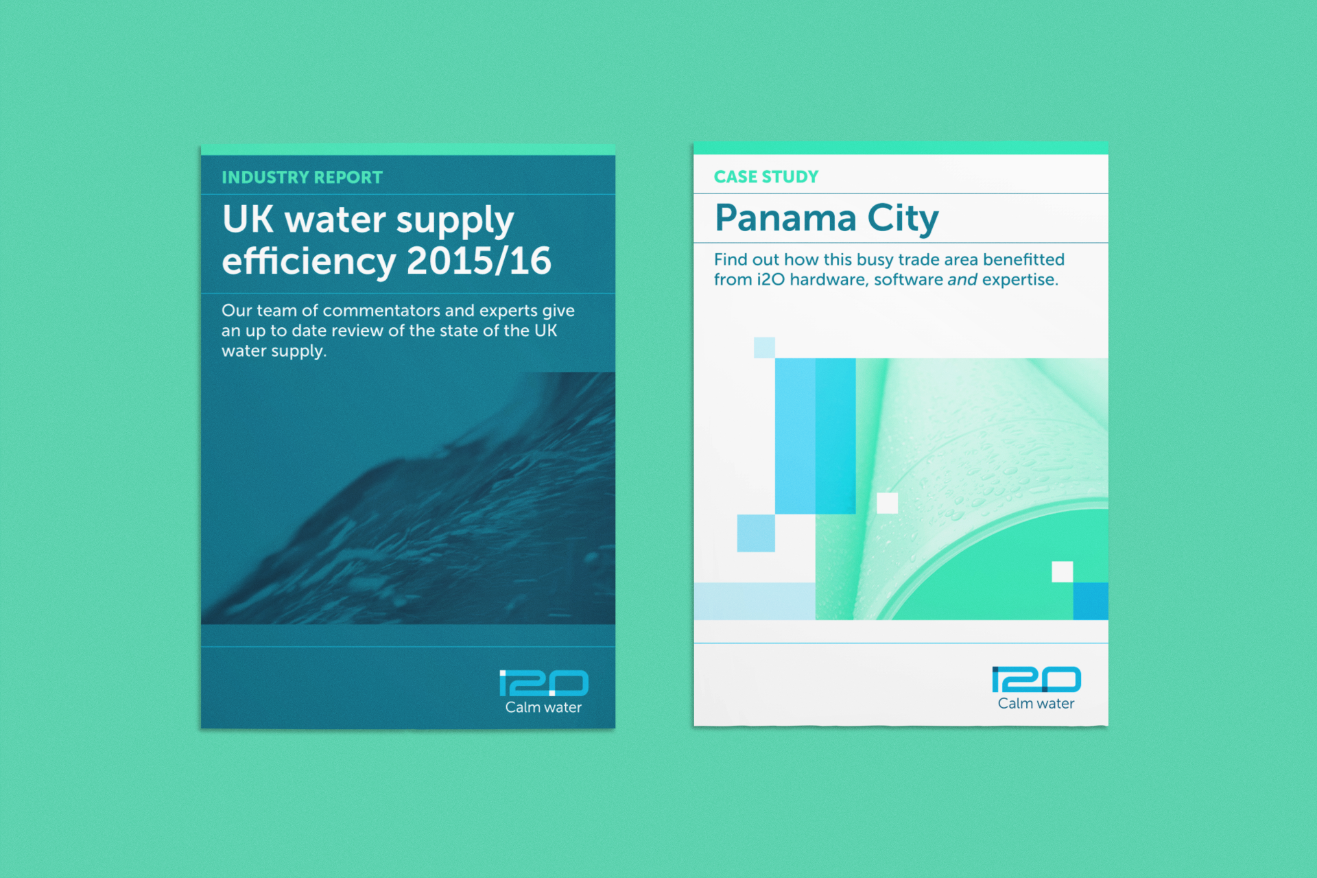
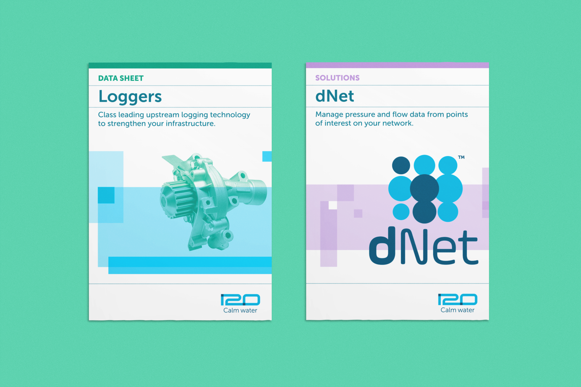
• A suite of marketing materials and internal communications assets
• Stationery and templates to ensure brand consistency across regions
The result is a confident, coherent identity that positions i20 as a global leader in water network intelligence and efficiency.