Scope: Visual identity, graphic system, and applications across print and digital media.
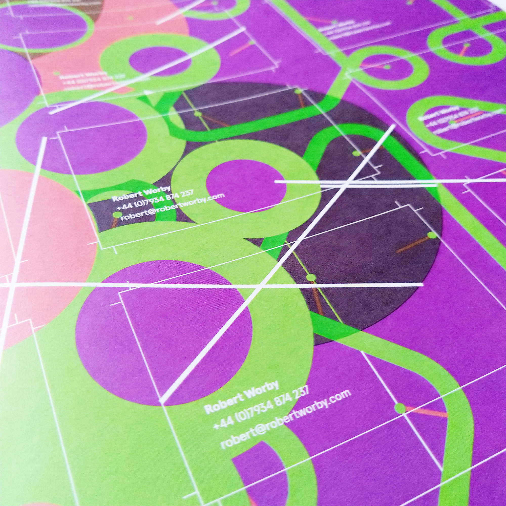
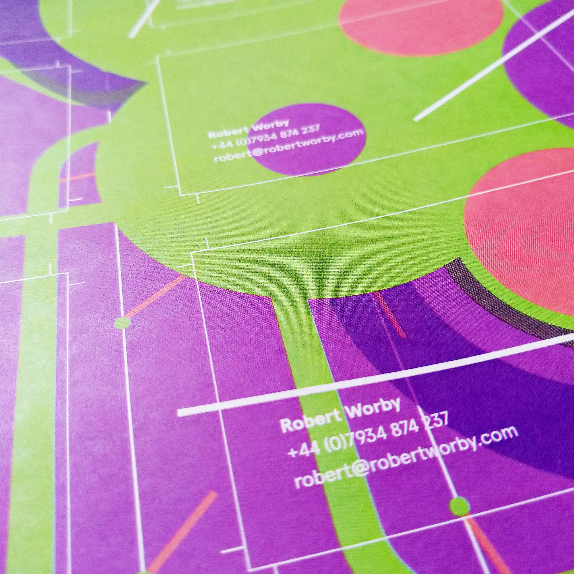
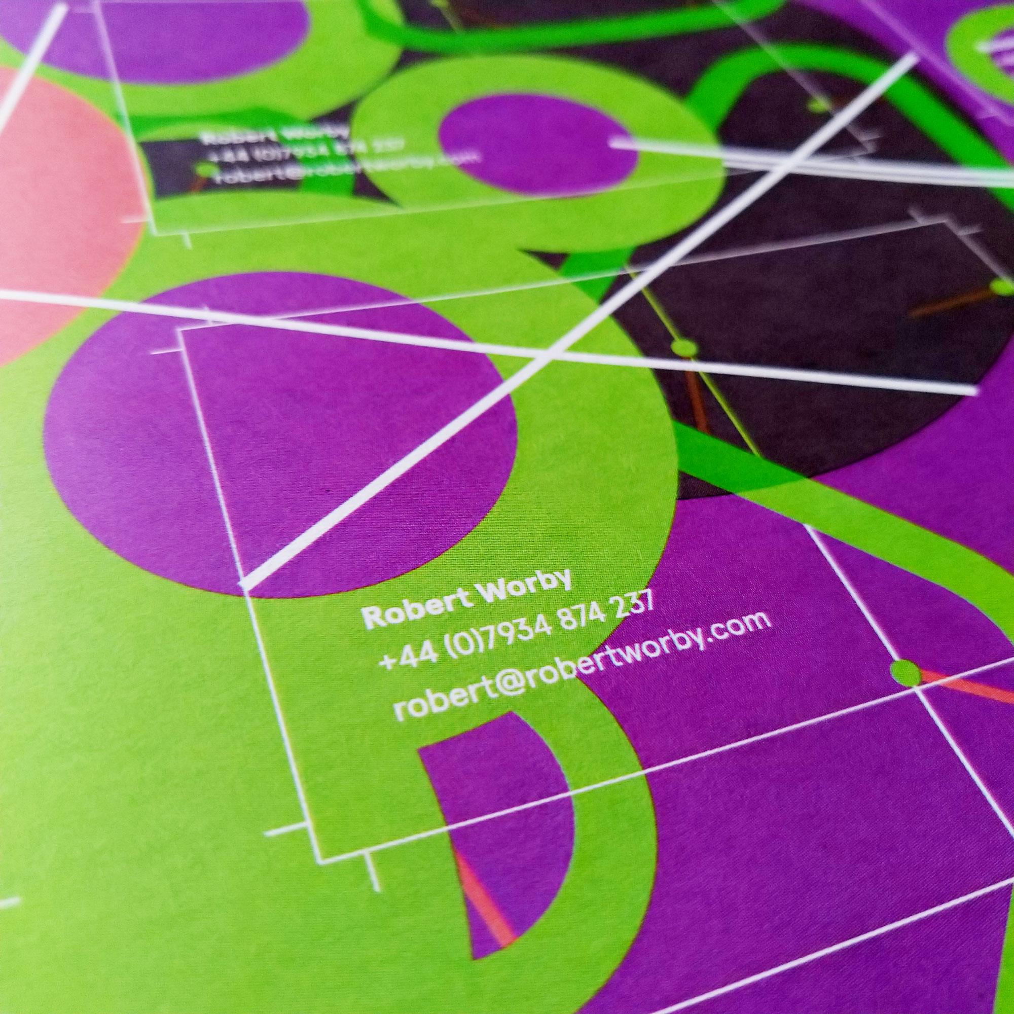
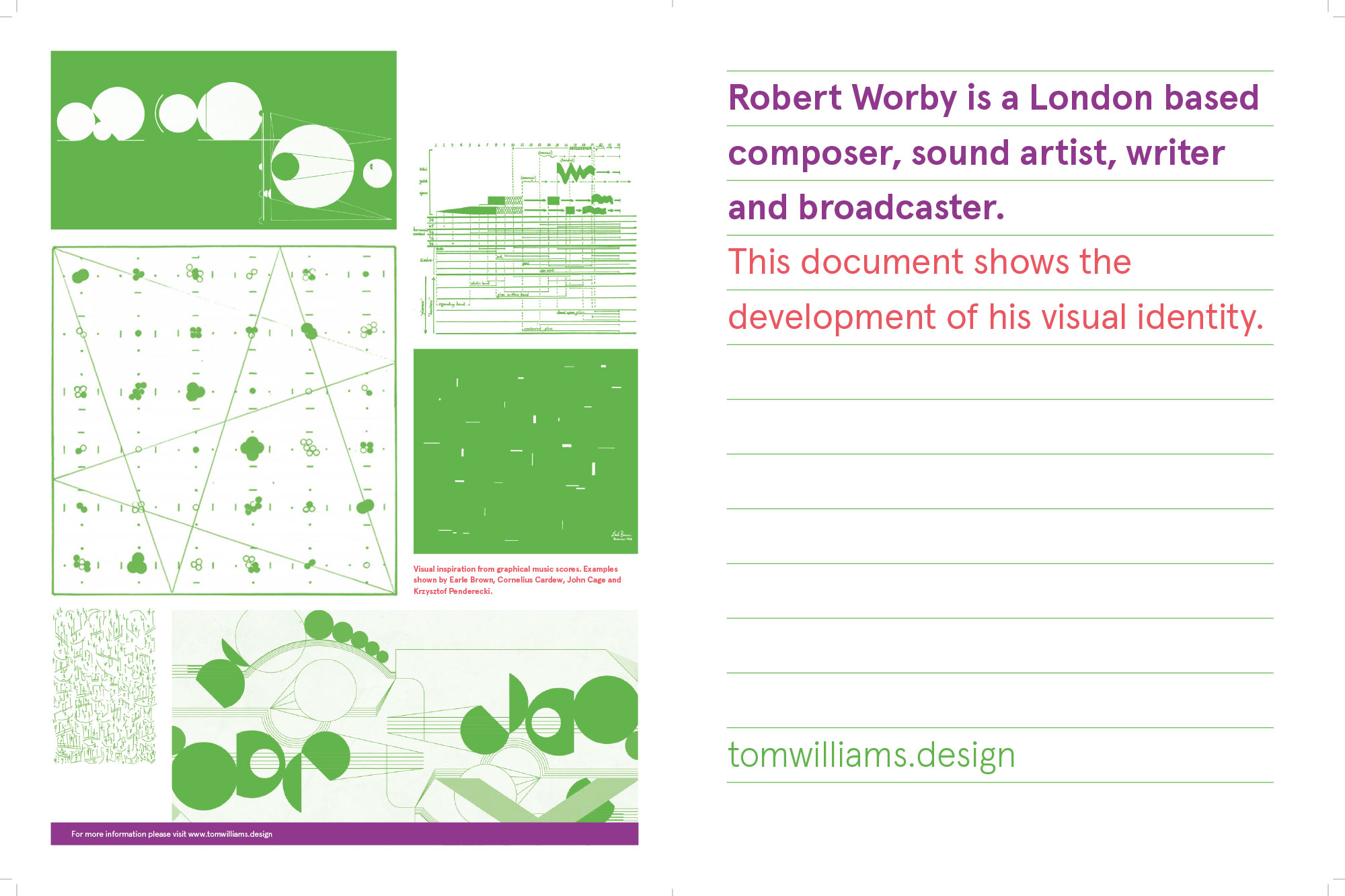
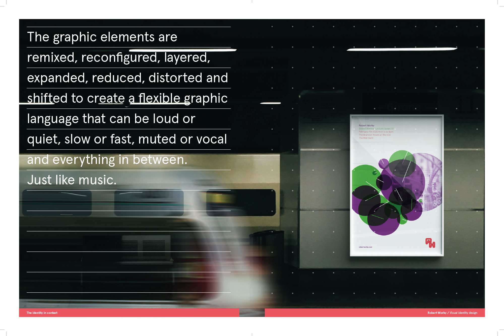
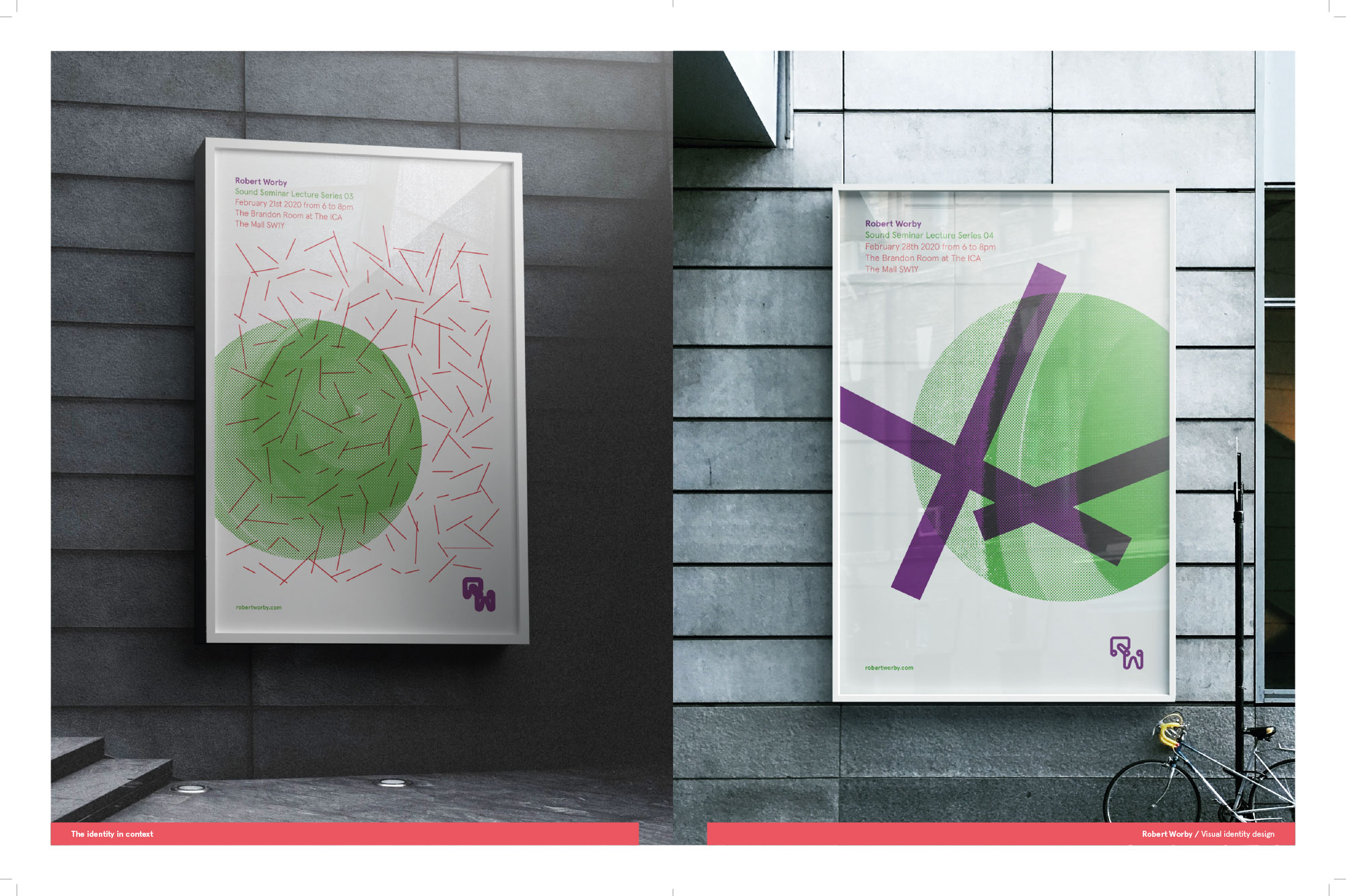
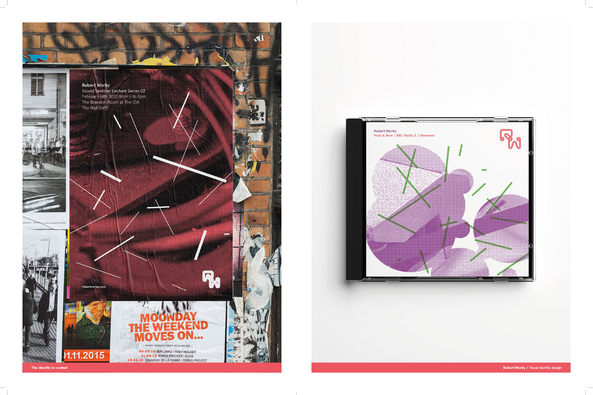
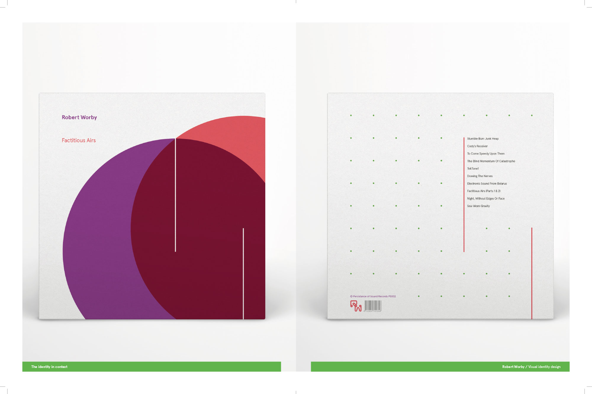
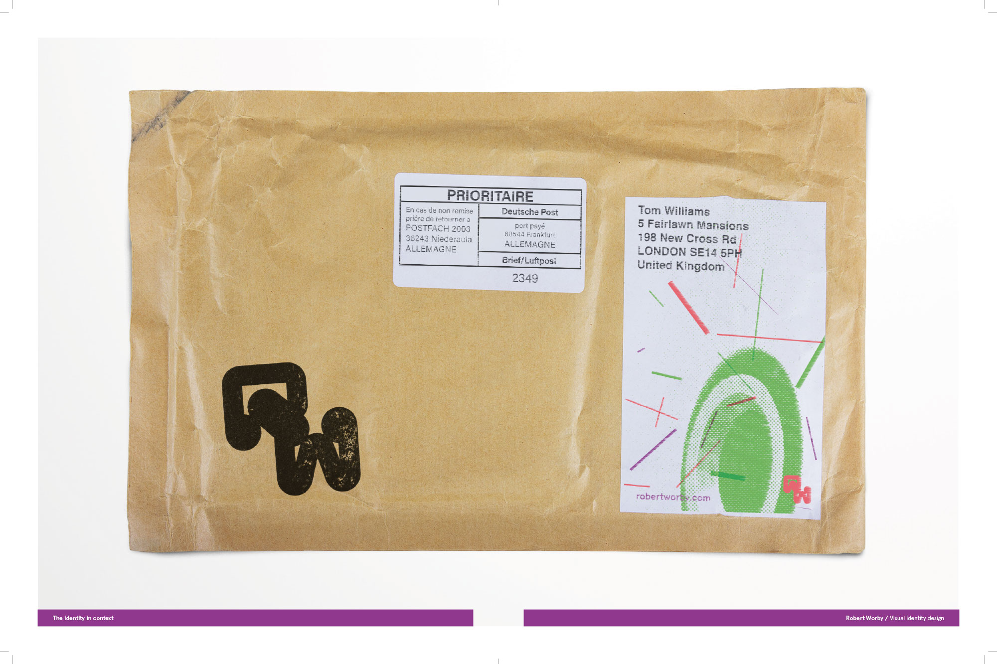
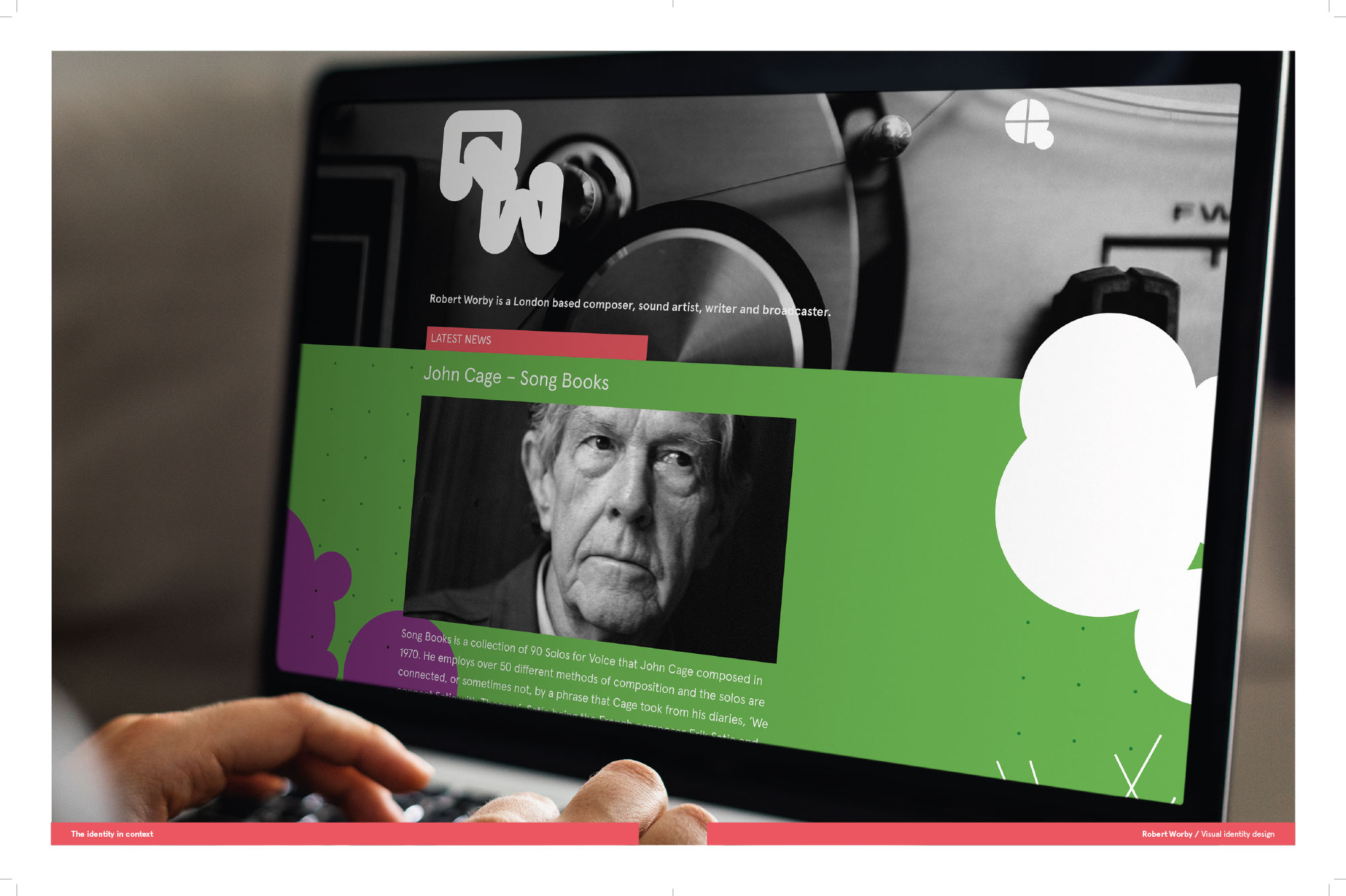
The client, a London-based composer, sound artist, writer, and broadcaster, specialises in experimental music and sound. I developed a flexible visual identity that could adapt to a wide range of outputs, including posters, CD covers, business cards, mailing materials, and his website.
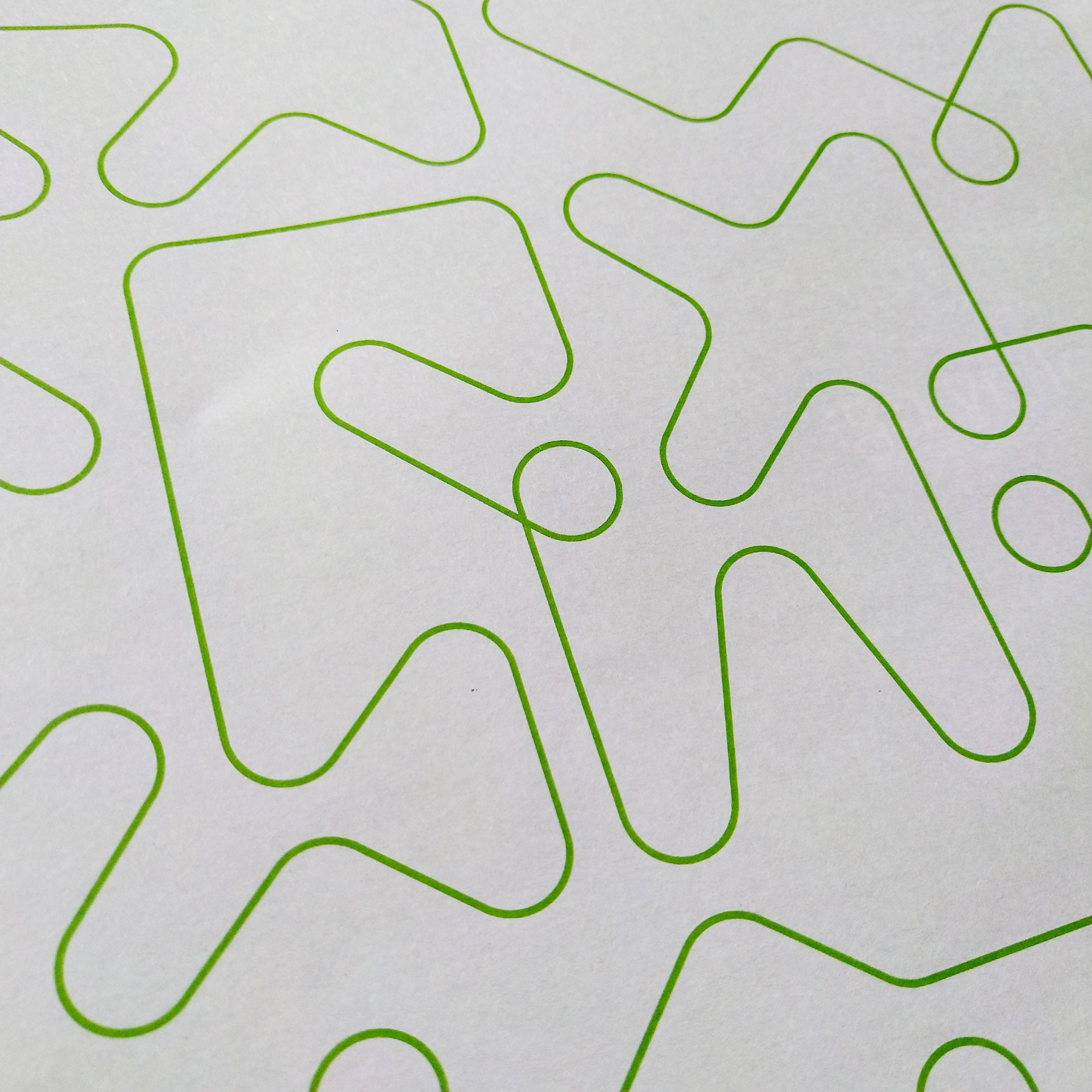
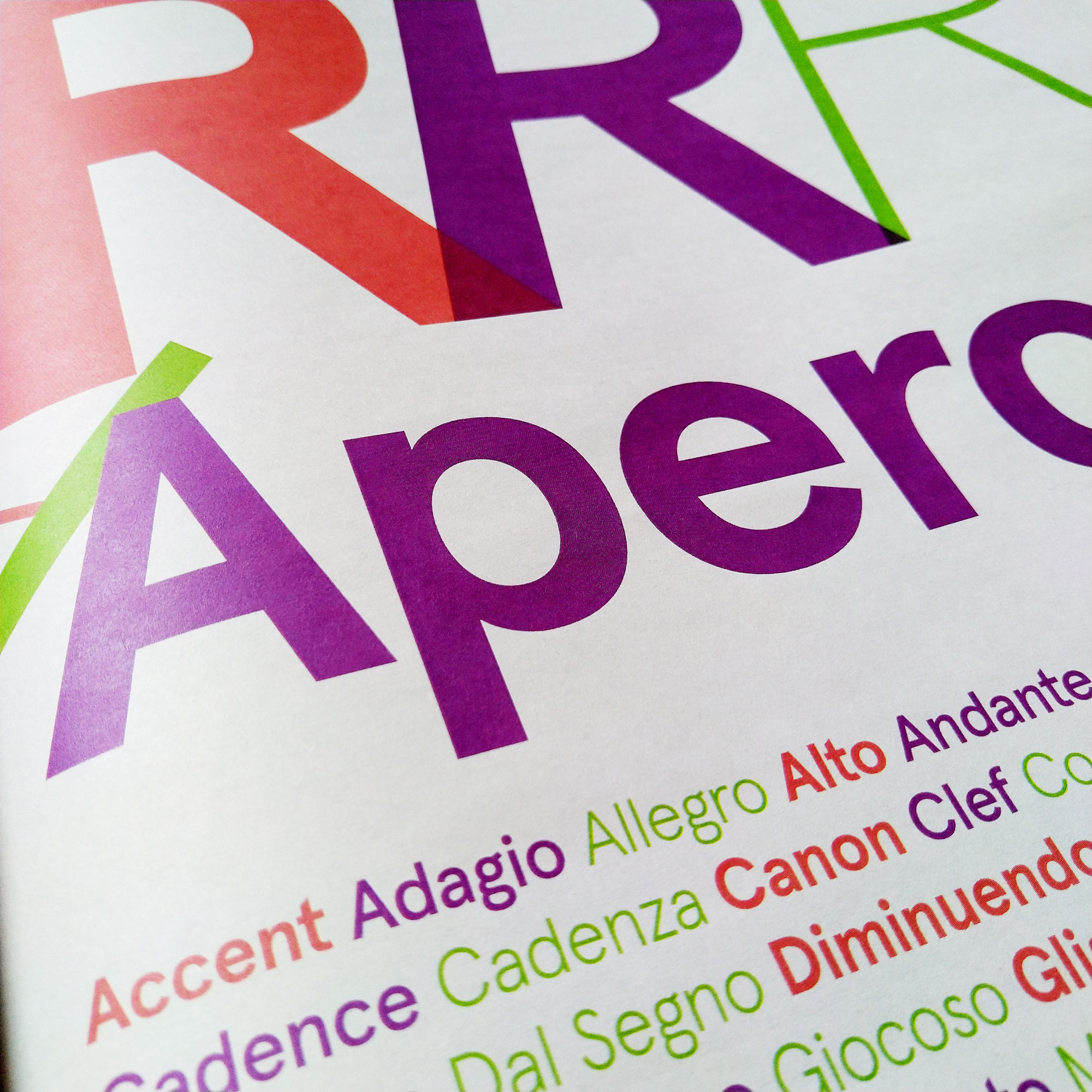
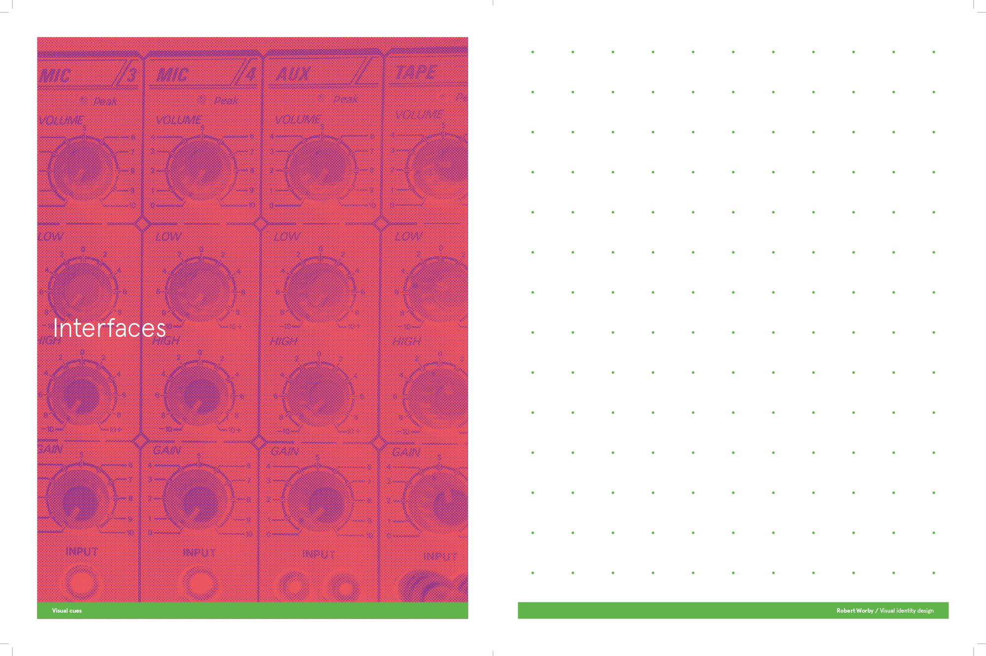
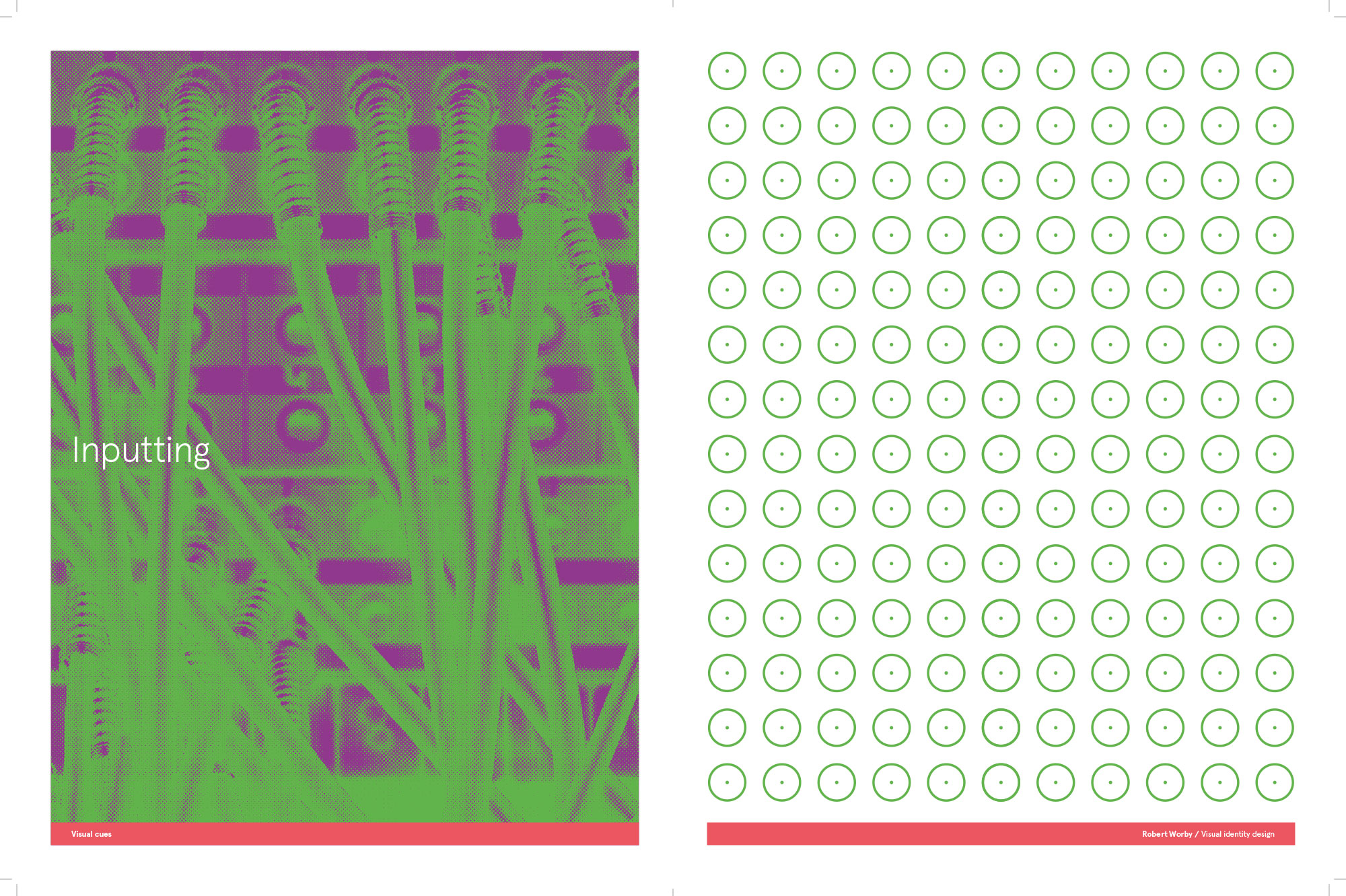
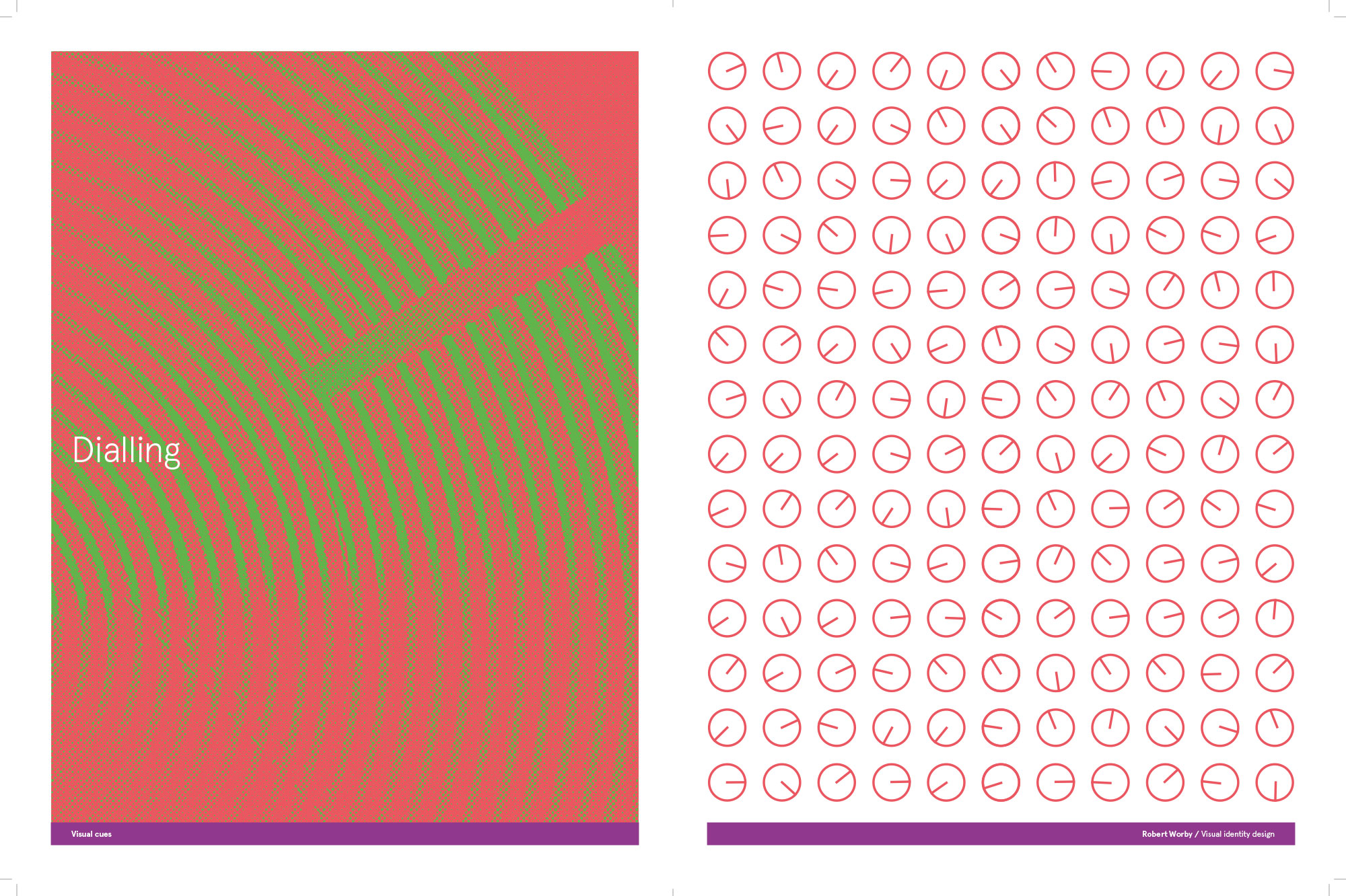
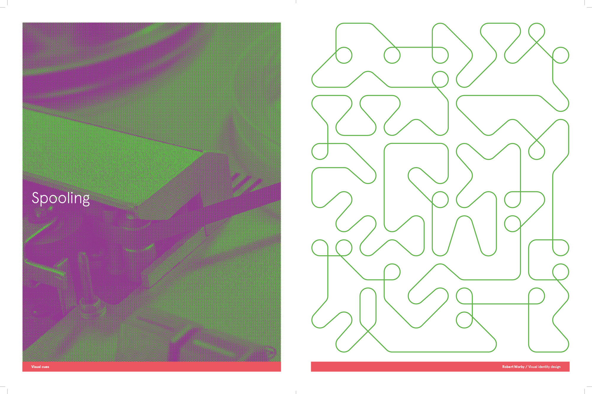
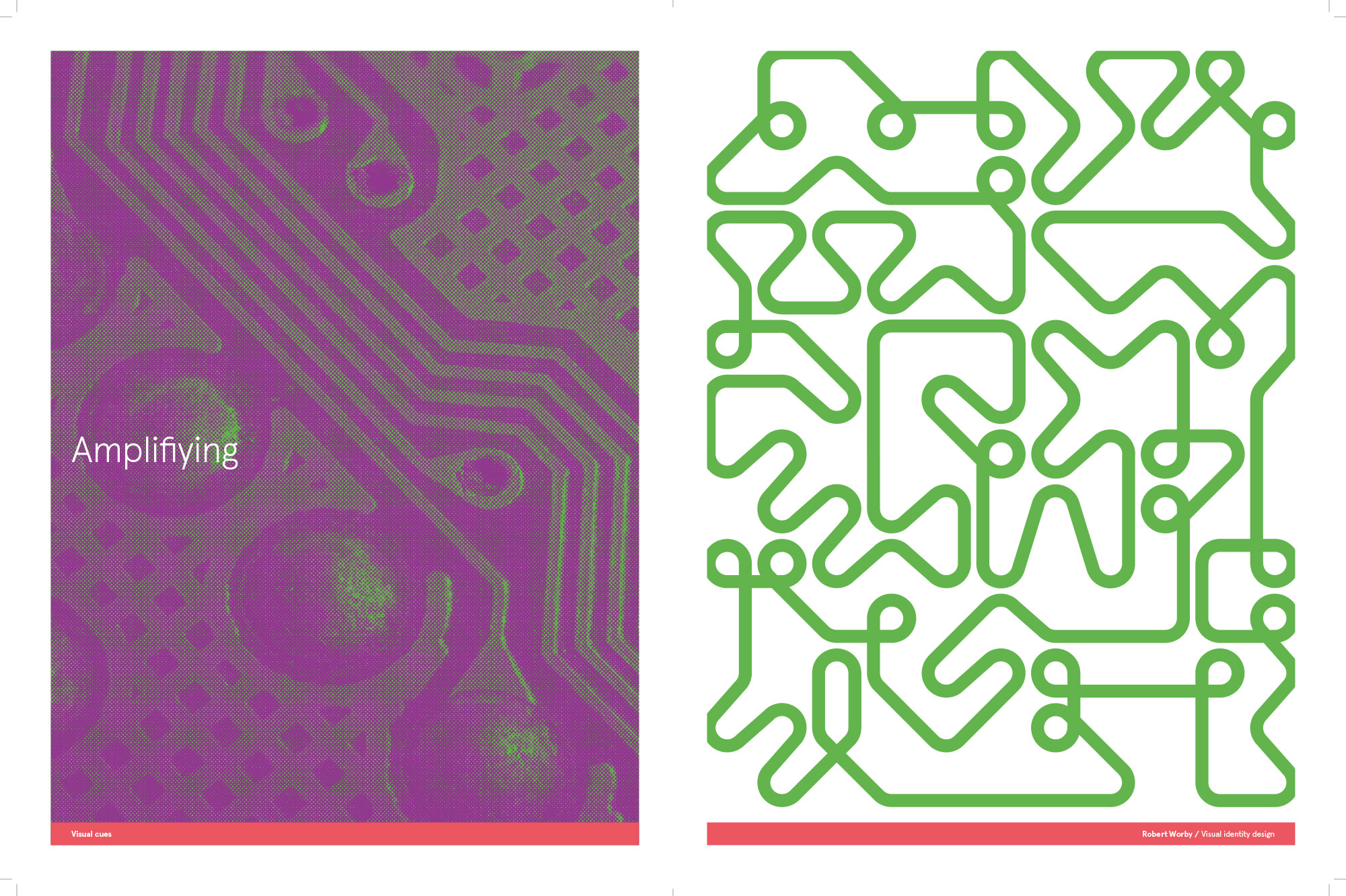
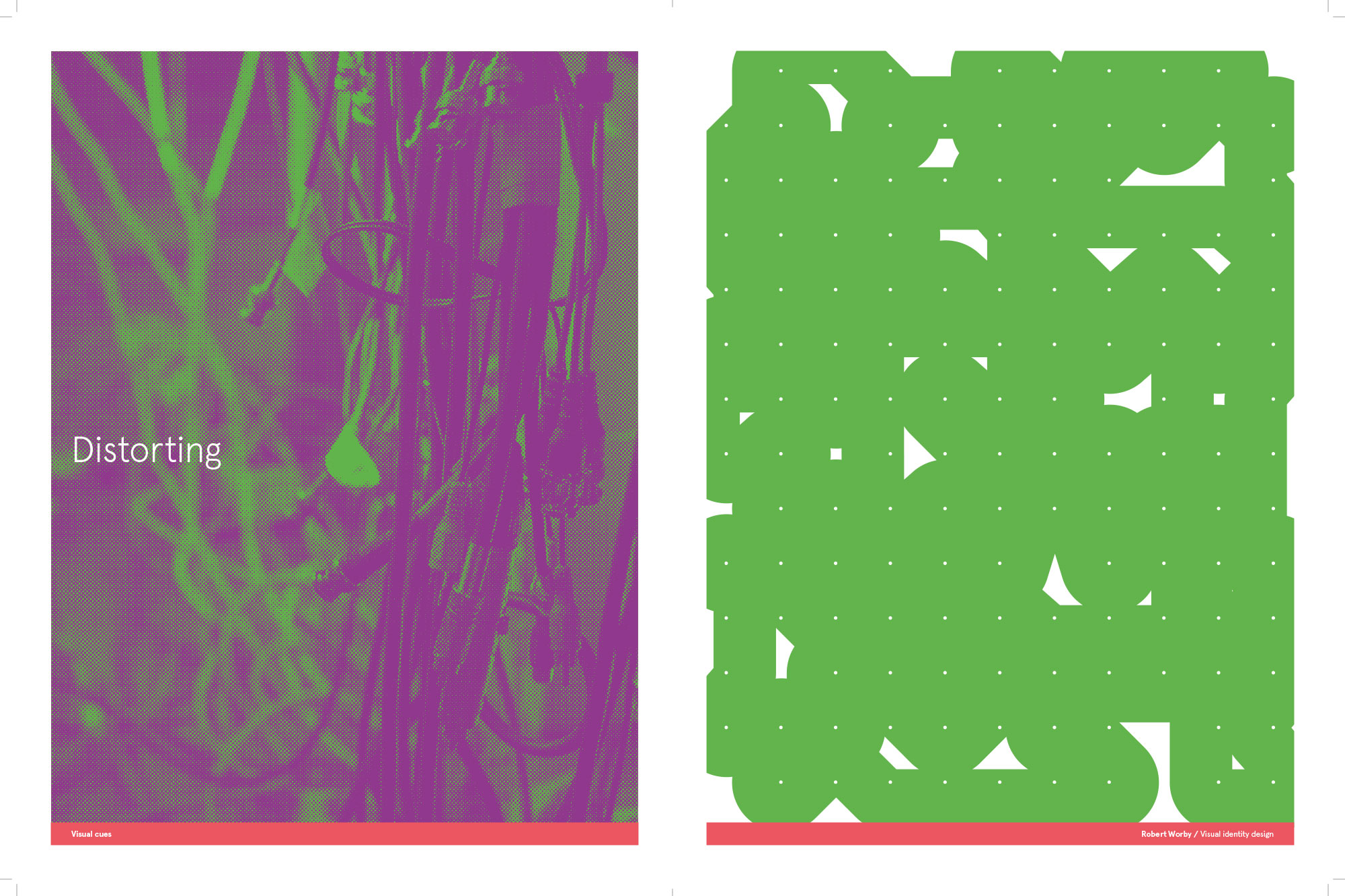
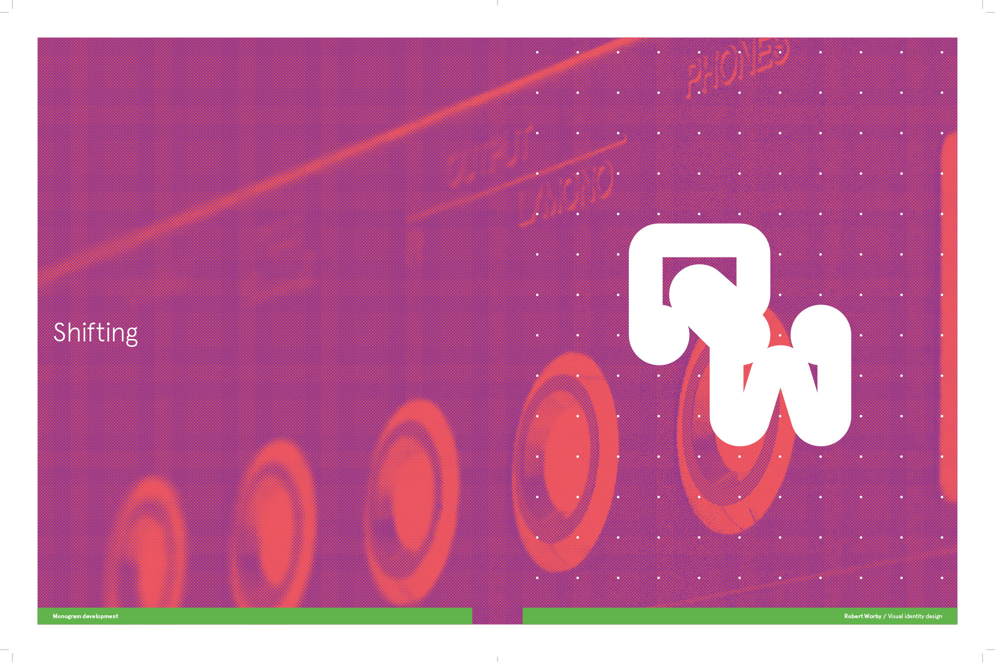
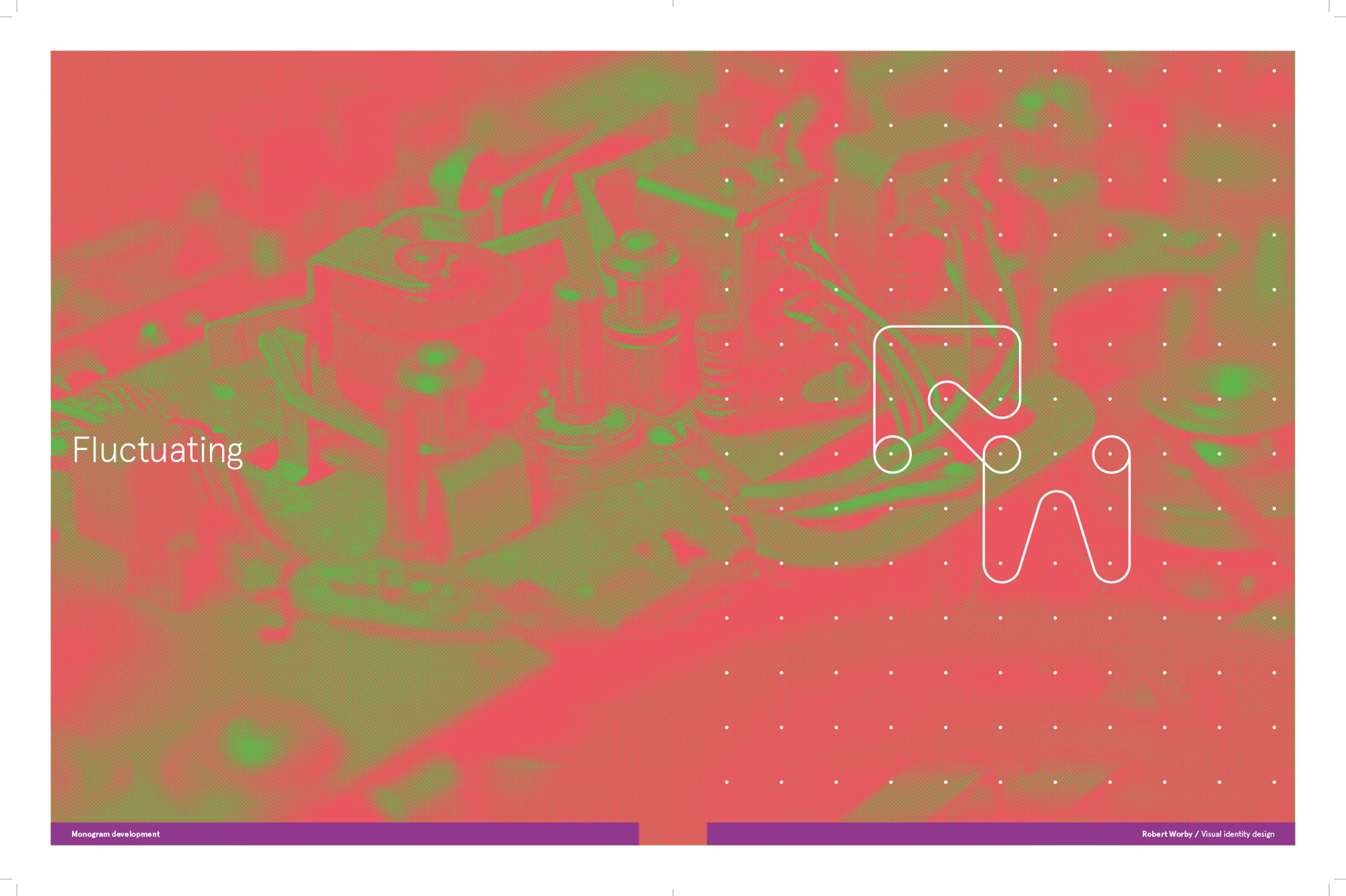
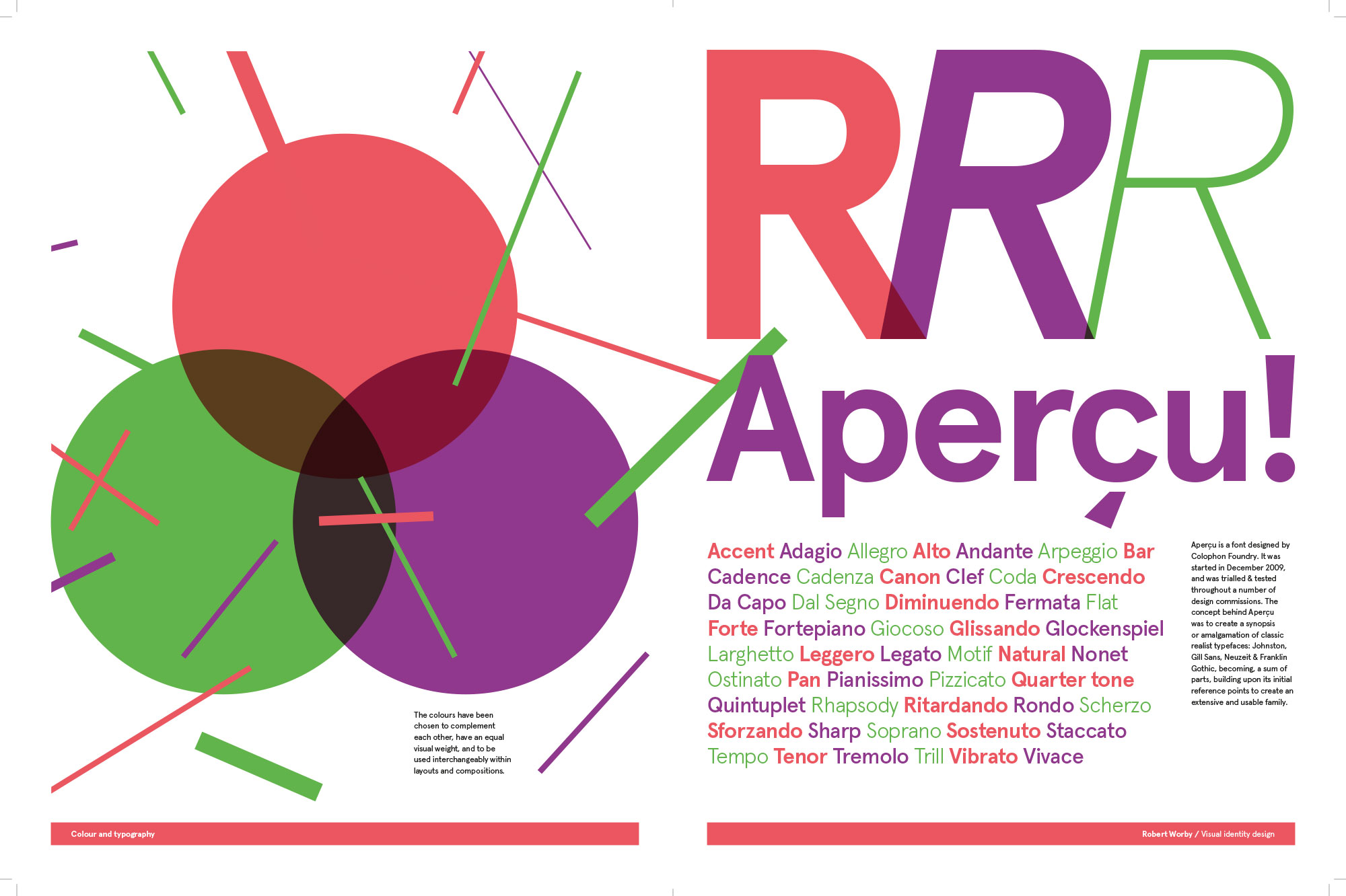
The visual concept drew inspiration from audio equipment interfaces and physical characteristics — including dials, knobs, patch bays, tape reels, wires, circuitry, buttons, amplification, and distortion — as well as graphical scores by John Cage, Earle Brown, and Cornelius Cardew.
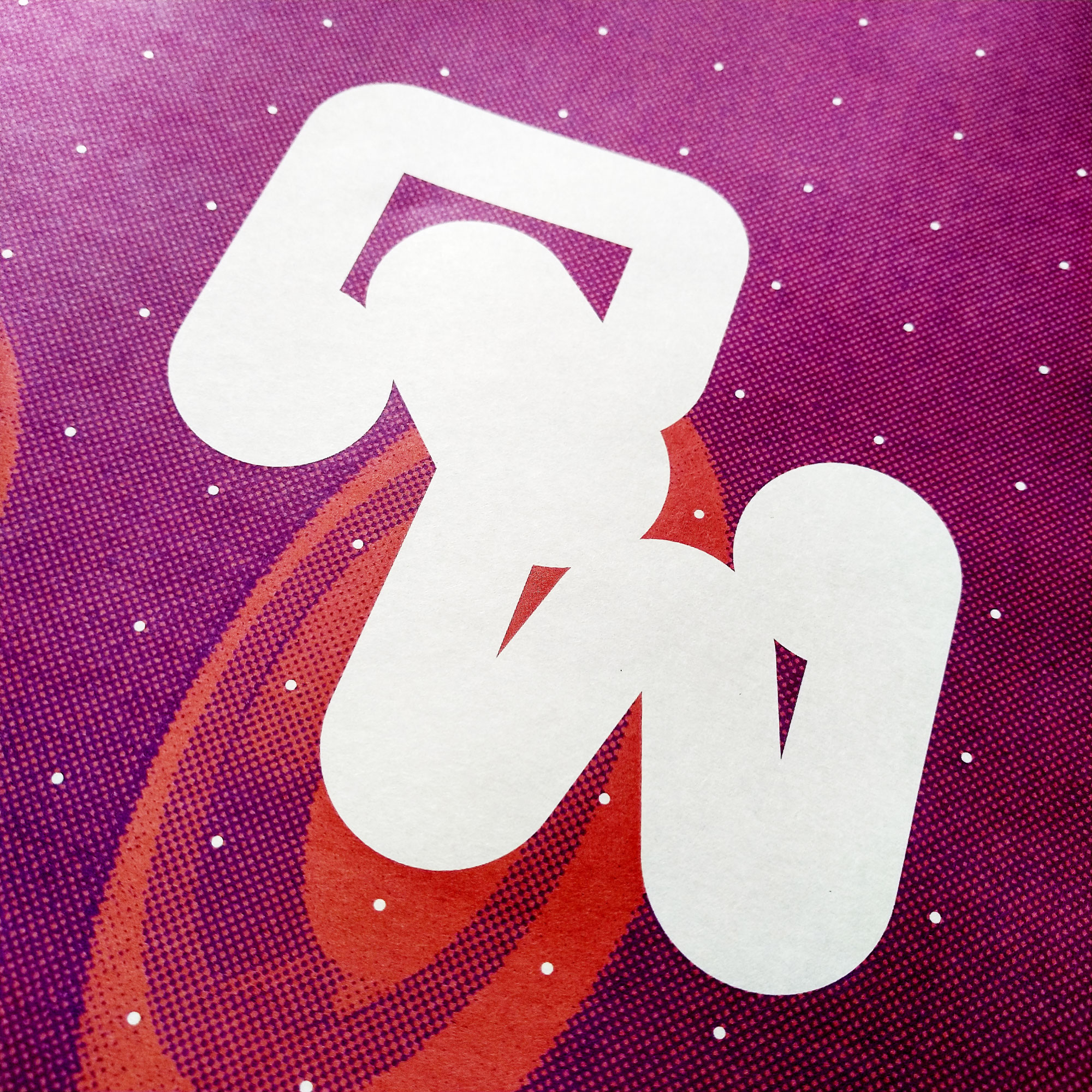
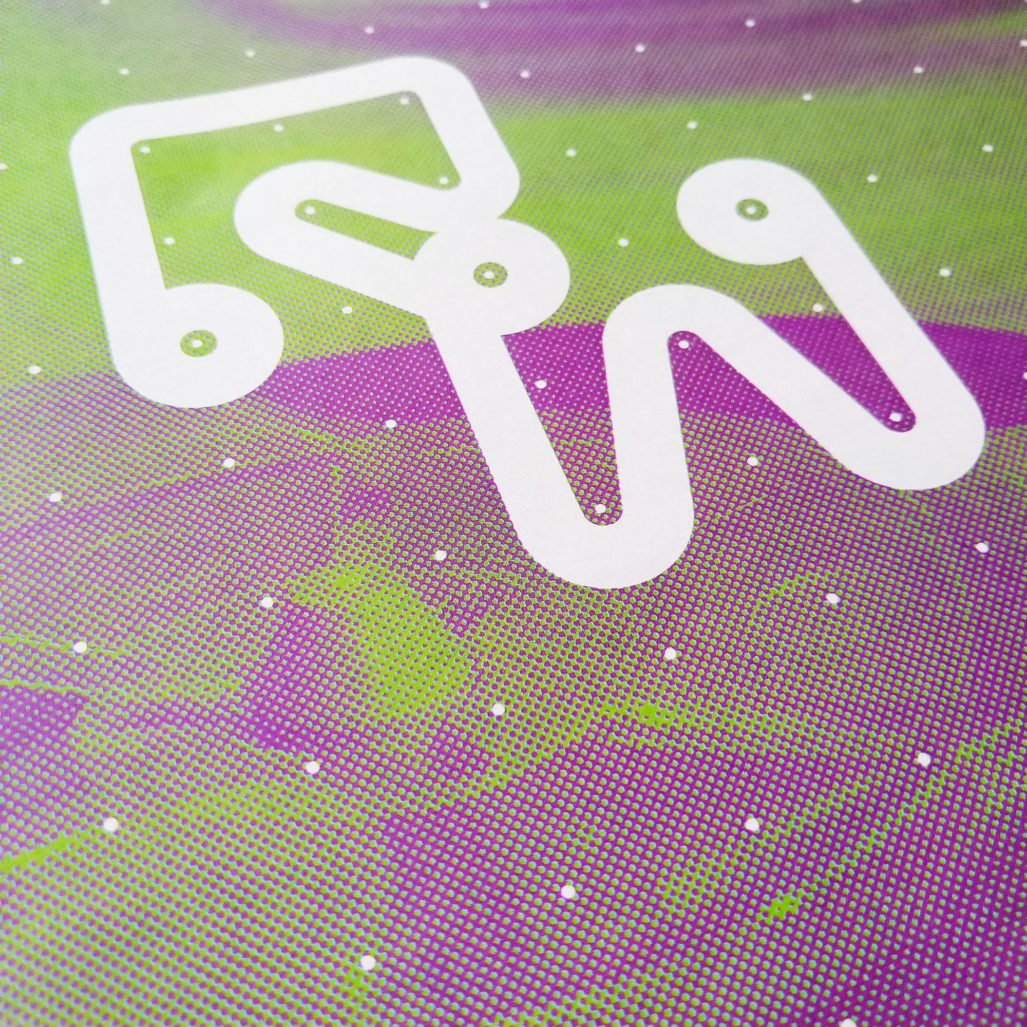
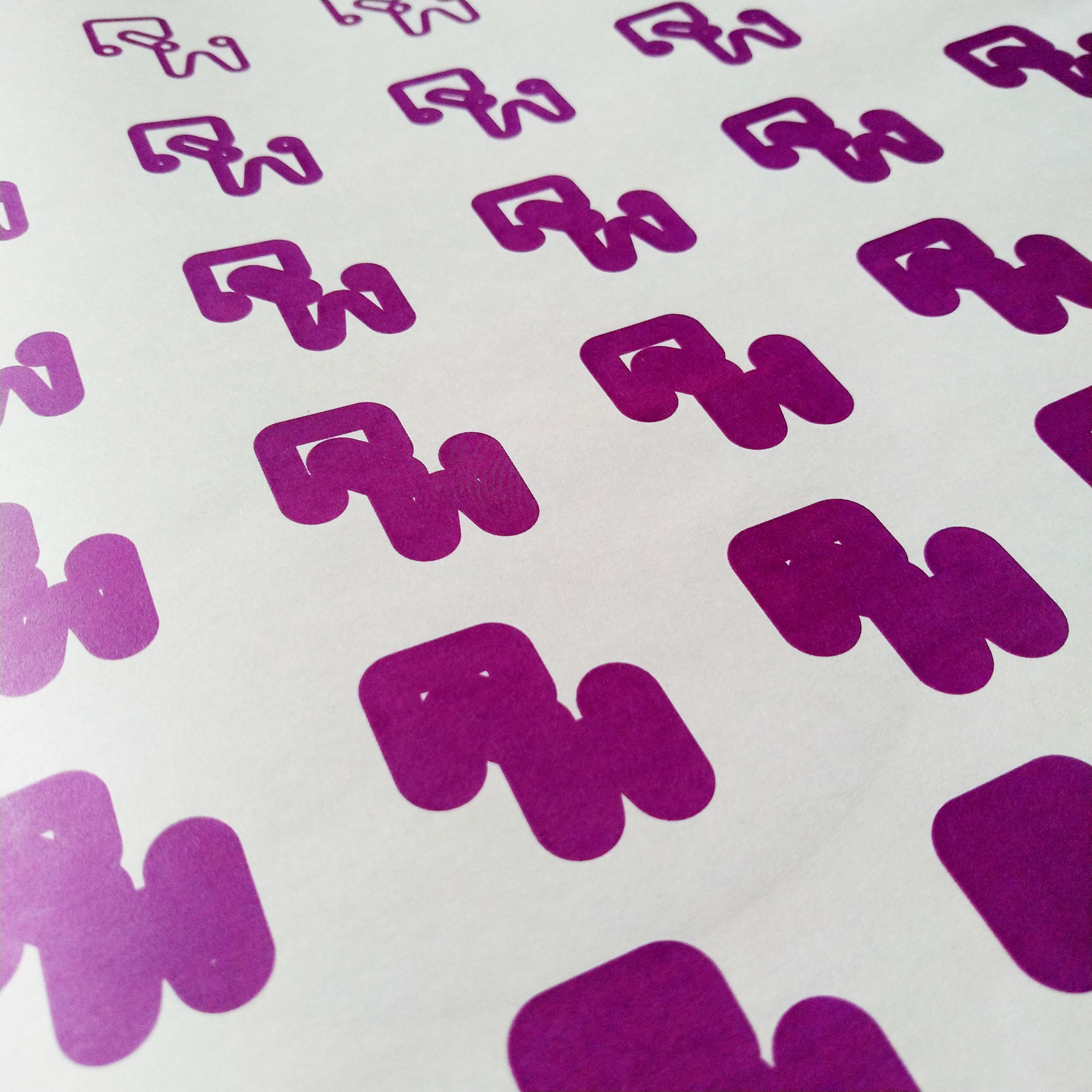
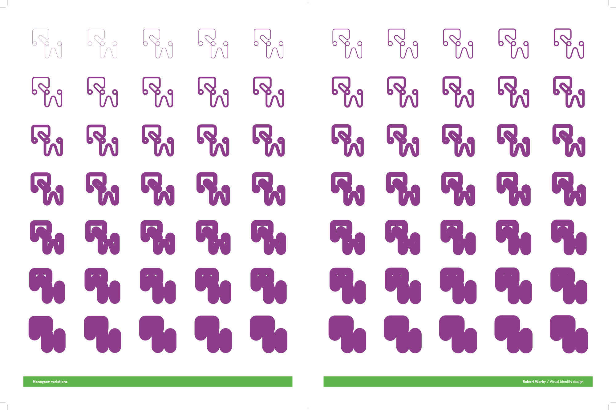
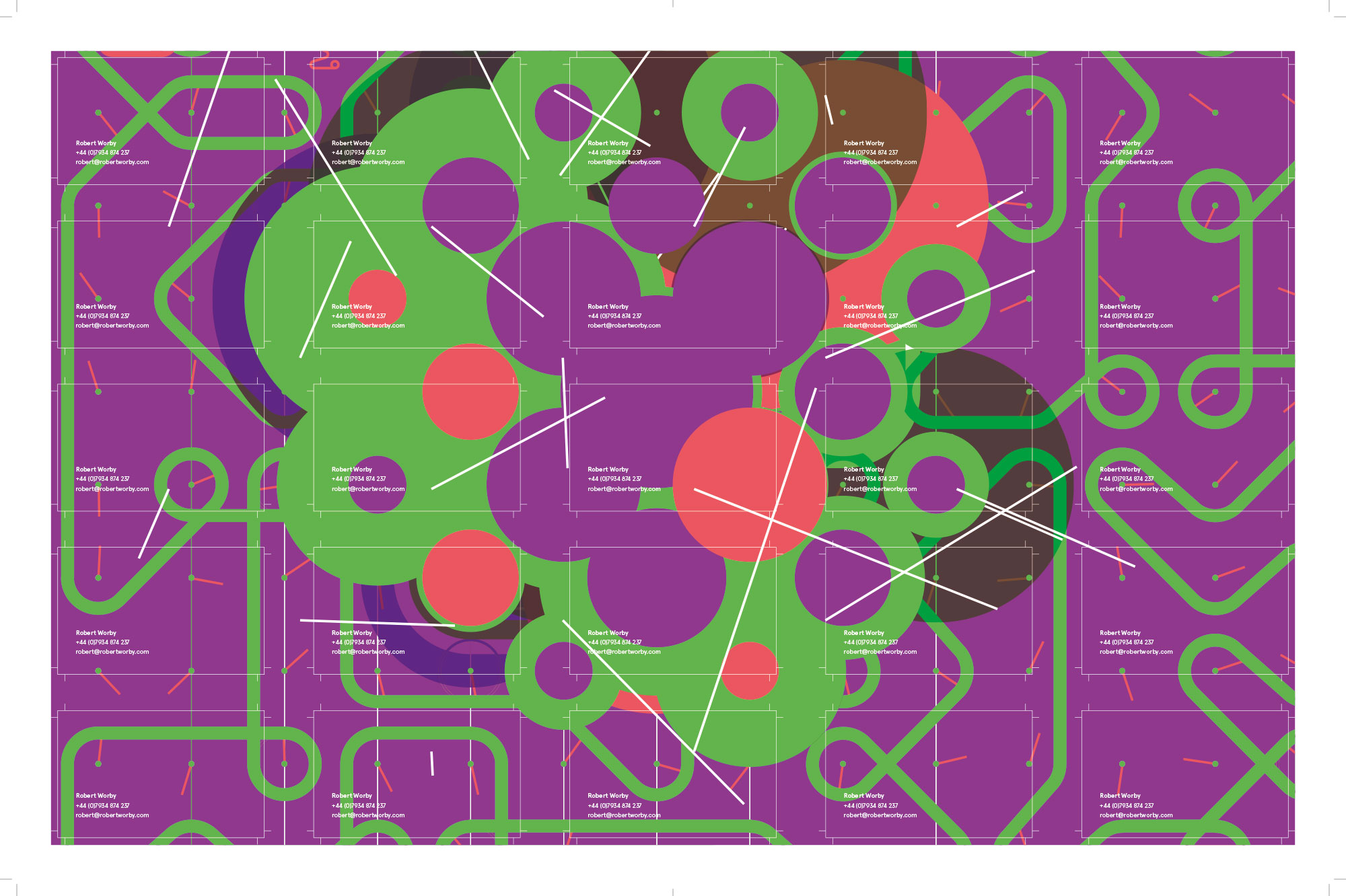
I established a simple modular grid as the foundation for the identity, enabling the creation and arrangement of dynamic graphic elements. This included a monogram capable of shifting form in response to sound, allowing it to adapt across various applications while maintaining a cohesive brand presence.
A key principle of the identity was volume flexibility: the visual language could be quiet and restrained or bold and expressive, reflecting the diversity of the client’s projects and ensuring the brand remained fresh and engaging over time.
The project was supported by a visual strategy document outlining the identity’s development, principles, and practical applications.