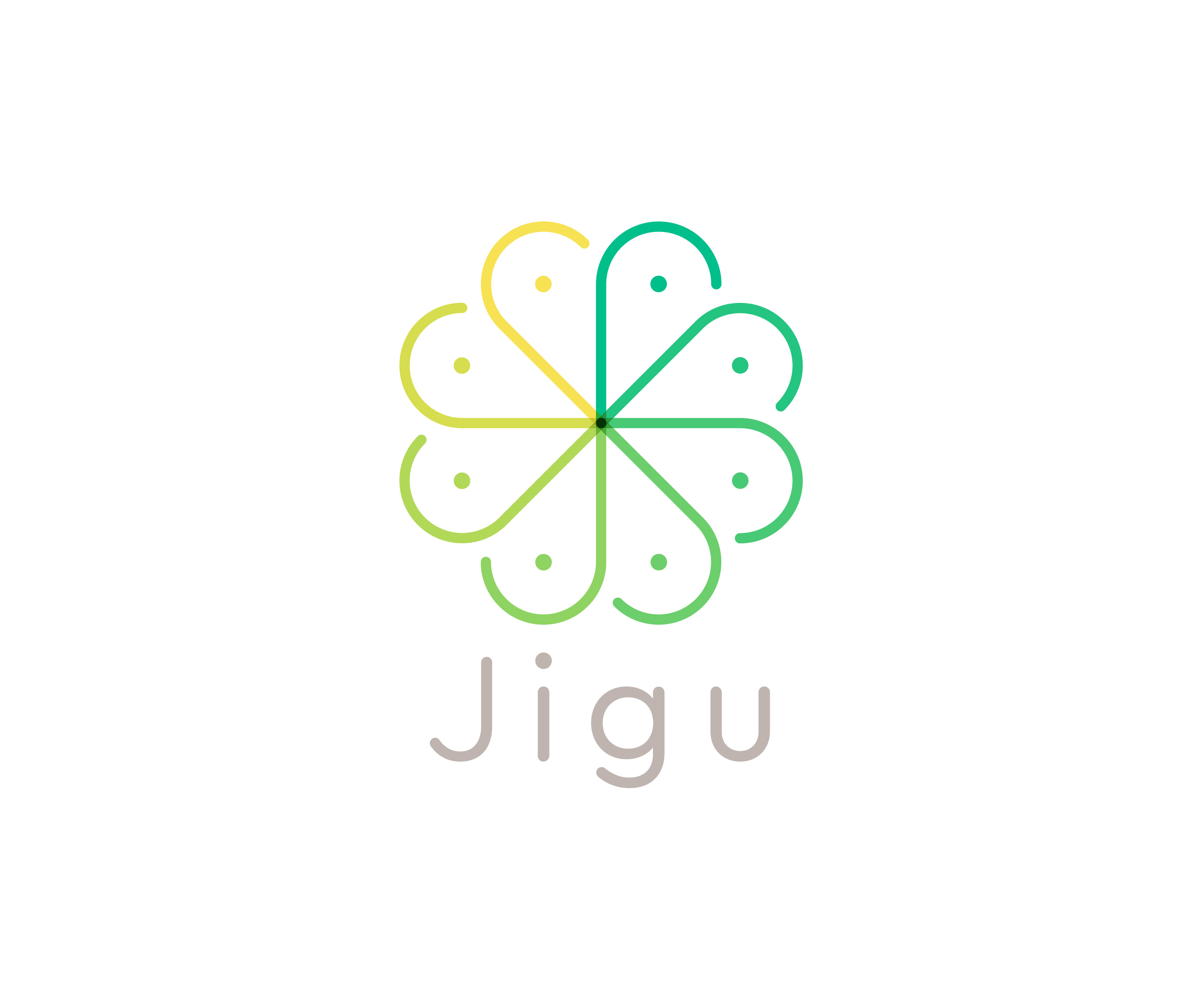
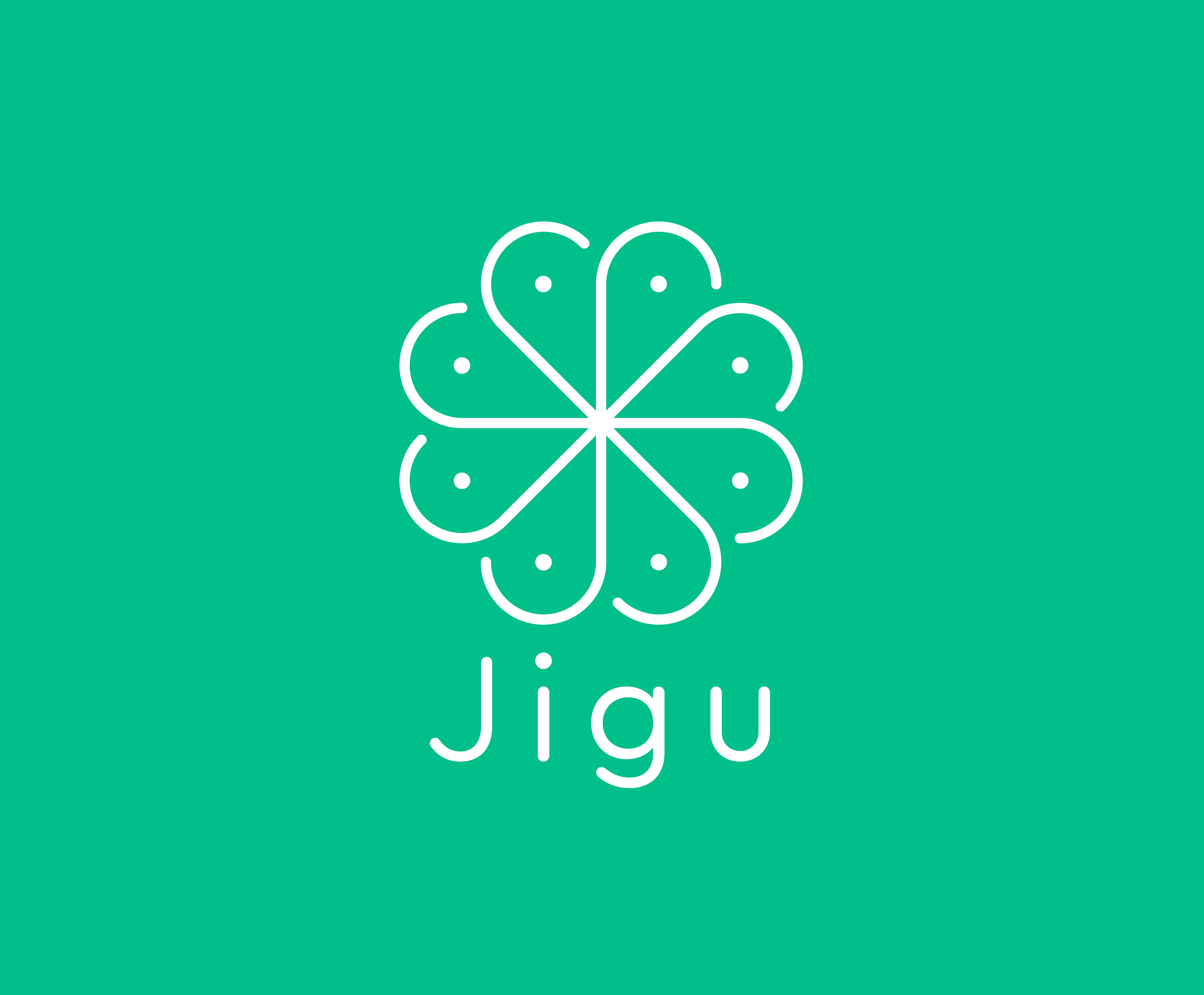
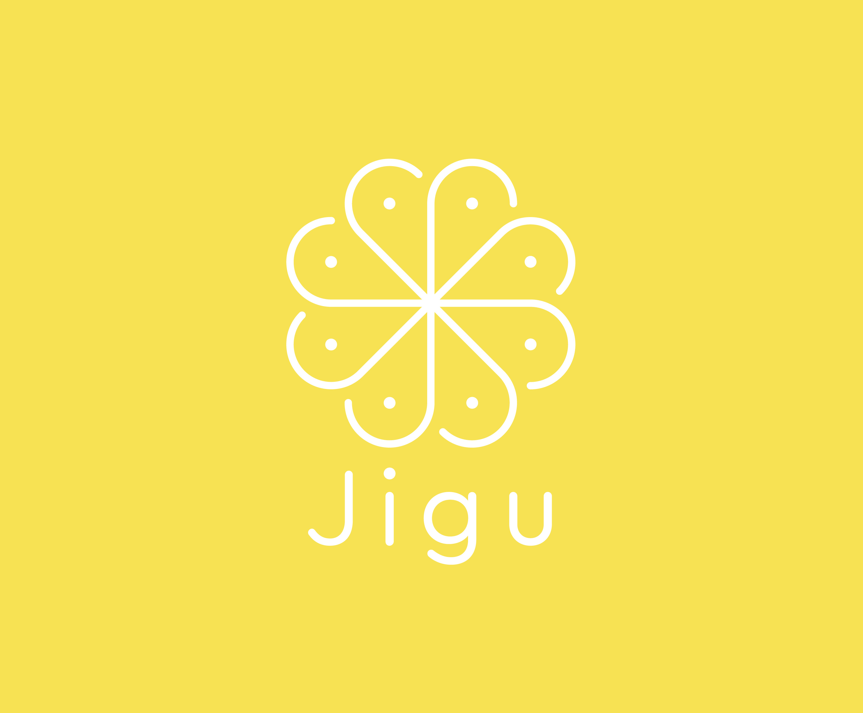
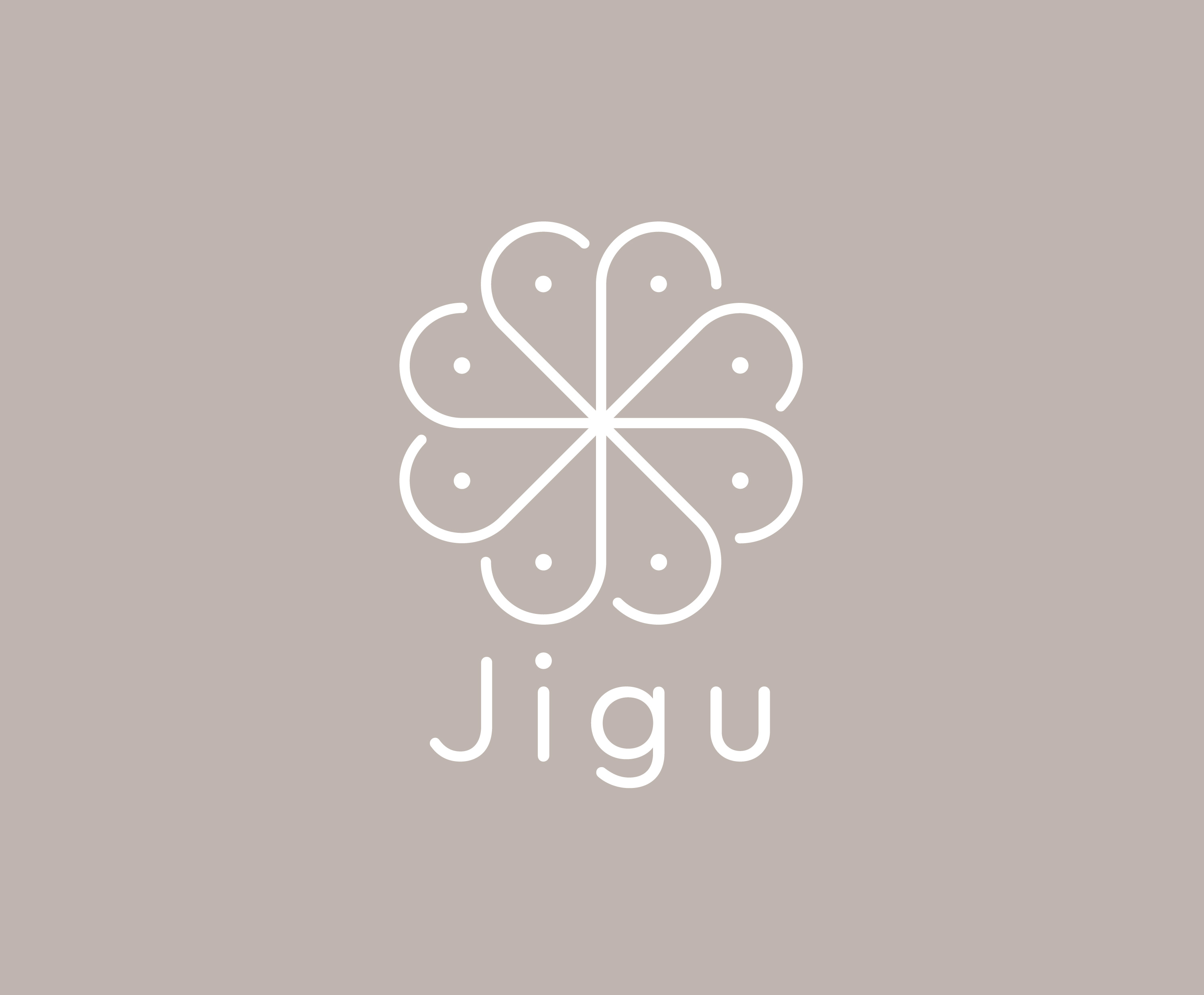
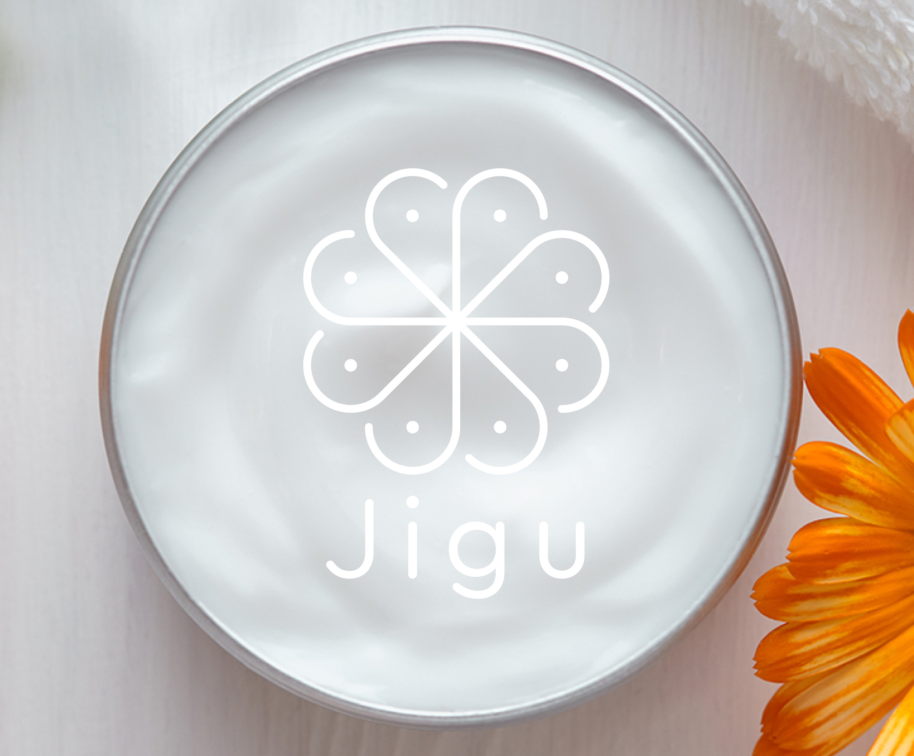
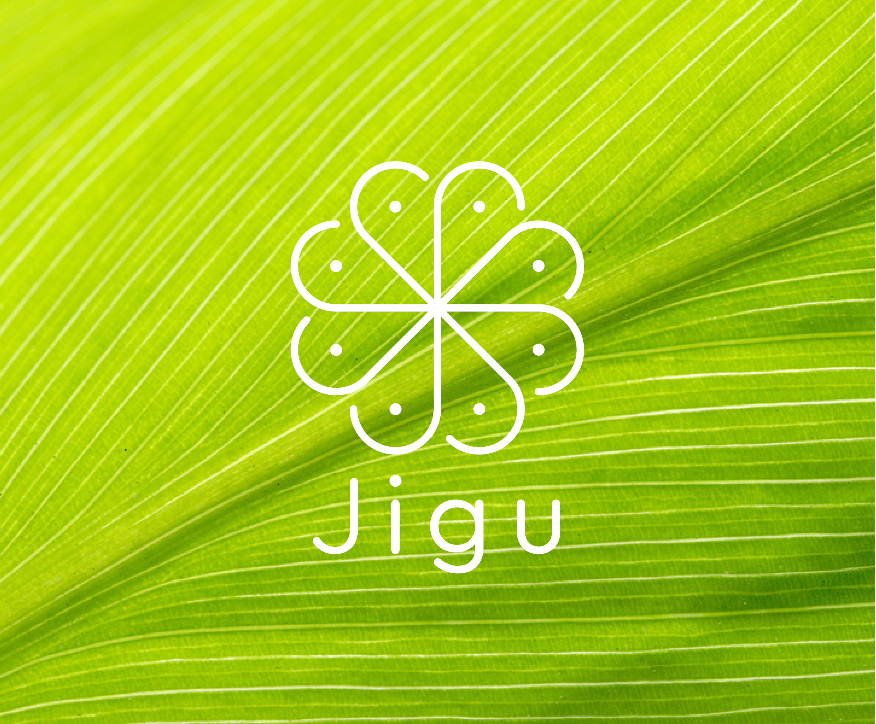
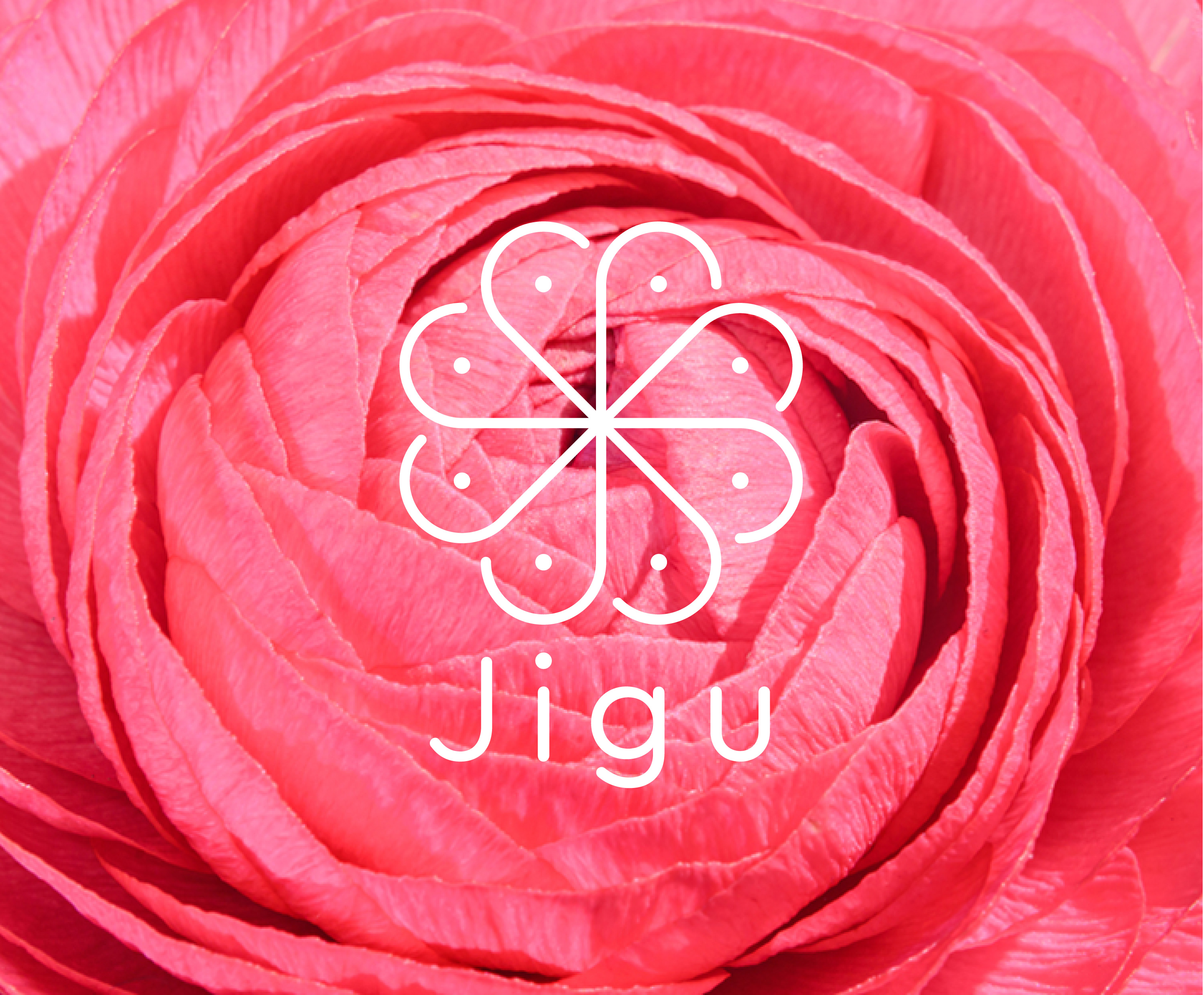
Jigu is an innovative startup that offers health and beauty products on a subscription basis. The Jigu philosophy is underpinned by Korean skincare and well-being principles. The name Jigu translates as ‘Earth’ in English, a nod to the natural ethos behind the brand.
I created a memorable, modern mark with a strong internal geometry which as well as being based on a ‘J’ letterform, suggested ideas of balance, nature and progression, and with its monoline form alludes to traditional Korean patterns.